print, typography
#
dutch-golden-age
# print
#
typography
#
coloured pencil
#
watercolor
#
historical font
Dimensions: height 257 mm, width 340 mm
Copyright: Rijks Museum: Open Domain
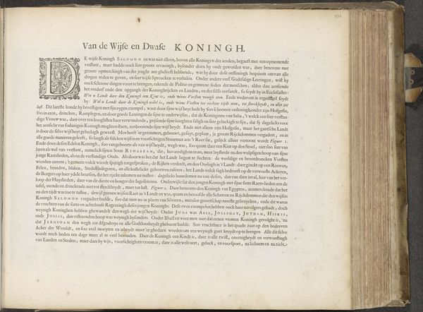
Curator: Right, so here we have "Van de Coningen Iuda", dating back to 1646. It's a print piece from Jan Philipsz Schabaelje, housed at the Rijksmuseum. Looking at it, the dense typography and the old paper have an intriguing antiquated mood, even. What jumps out at you? Editor: It's a very busy page! Almost overwhelming. The texture of the paper, the aged ink...it feels incredibly historical, obviously. How do you interpret this work, beyond it just being an old print? What's its significance? Curator: Well, you’ve already picked up on its materiality—the paper, the ink. Imagine the painstaking process of setting all that type! Each letter carefully placed. It's more than just a historical document; it’s a testament to craft. The title translates to “Of the Kings of Judah,” right? Considering the period, think about the religious and political climate. How might the act of printing and distributing texts like these be seen? Seditious, maybe? Editor: Possibly! So the content itself had importance, then, and this wasn’t just a common sort of thing being printed? The distribution was equally charged with meaning? Curator: Precisely. This wasn't disposable media. This was disseminating information in a world hungry for it, in a style accessible for its time. It is an early newsreel if you will. Editor: That’s a fascinating way to see it – as an early form of accessible media. Thanks, I definitely have a fresh perspective now. I was mostly intimidated by the density. Curator: Haha! Don't let the density fool you. Each tiny element contributes to a bigger story of artistry, politics and social upheaval. Looking closer reveals the magic.
Comments
No comments
Be the first to comment and join the conversation on the ultimate creative platform.
More like this