#
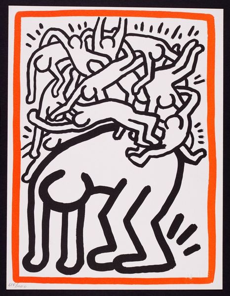
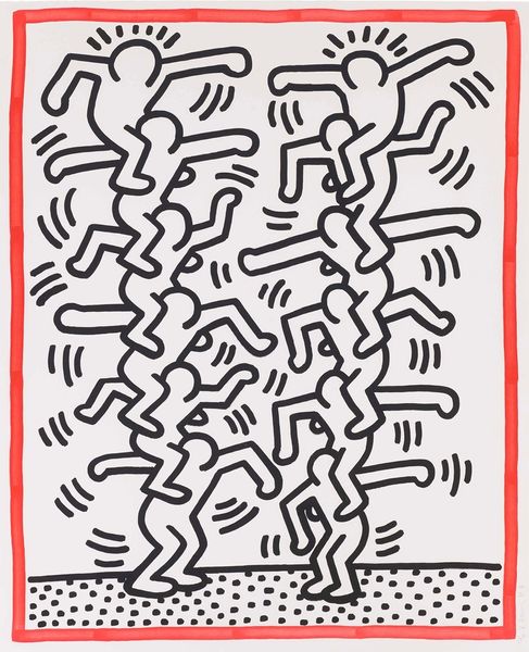
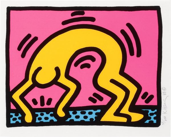
neo-pop
Copyright: Modern Artists: Artvee
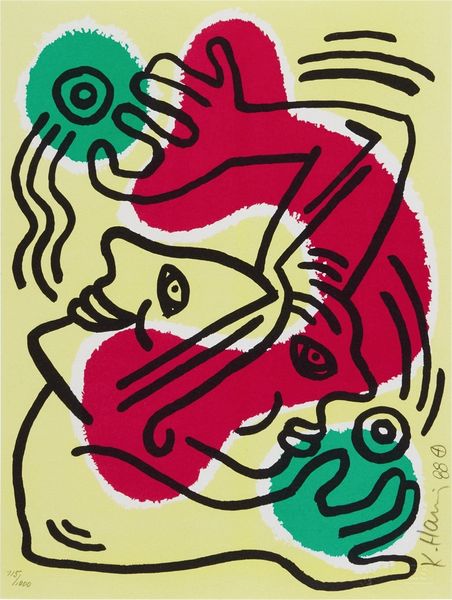
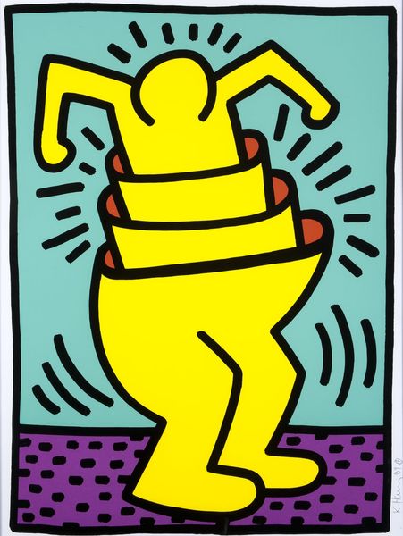
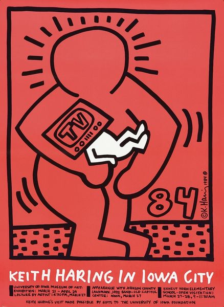
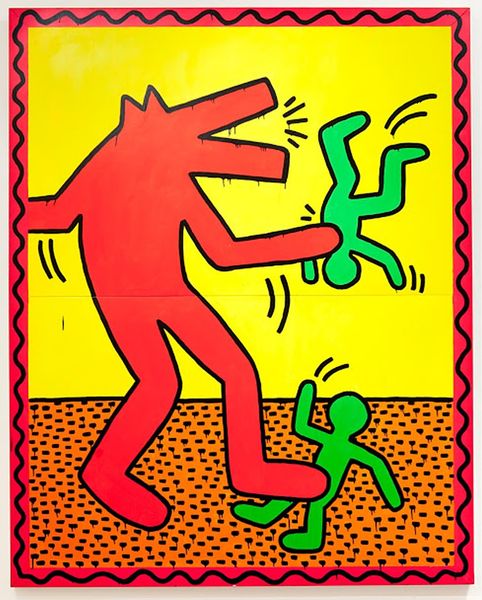
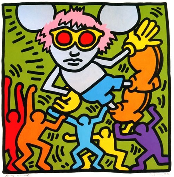
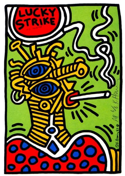
Editor: So, here we have Keith Haring's "Untitled" drawing from 1984, rendered with acrylic paint. The figure really grabs your attention, doesn't it? With its bold outlines and that playful, almost cartoonish feel... what stands out to you most when you look at it? Curator: I see a vibrant snapshot of 1980s counterculture, channeling anxieties through an accessible, almost childlike visual language. Haring's figures weren't just art; they were interventions. This particular piece makes me think about consumerism, referencing the "Le Mans 24 HR" race. He captures this blend of excitement, maybe a bit too much... and commercial obsession that defined that era. Do you notice the figure’s exaggerated features? Editor: I do, especially the checkerboard pattern on the stomach. It's a bit unsettling paired with the rounded features of the rest of the character, now that you mention the underlying message. Curator: Exactly. That juxtaposition is classic Haring. He’s subverting the idea of pure fun. And it's hard to ignore how his art became intrinsically linked with social activism. This wasn’t just Pop Art, it was a form of visual protest, echoing concerns about corporate influence and the AIDS epidemic lurking in the background, wasn’t it? How do you see the interplay of these light and dark themes in his work? Editor: It's a lot to take in but, viewing his works from this lens helps me understand it more deeply. There's so much more beneath the surface than I originally saw. Curator: Absolutely. By engaging with the socio-political contexts, Haring's art transforms from simple pop aesthetics into potent cultural commentary, making it all the more powerful and enduring.
Comments
No comments
Be the first to comment and join the conversation on the ultimate creative platform.
More like this