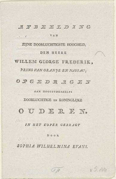
graphic-art, print, typography, engraving
#
graphic-art
# print
#
typography
#
romanticism
#
engraving
#
calligraphy
Dimensions: height 239 mm, width 143 mm
Copyright: Rijks Museum: Open Domain
Curator: Here we have a title page, "De Dweeper", which translates to "The Moper" or "The Dreamer". It's an engraving by Daniël Veelwaard for C. Spindler’s book from 1831, currently residing in the Rijksmuseum. Editor: My immediate reaction is the incredible detail in the typography! It seems so precise. I’m really drawn to the way the letters curl and interweave. What kind of tools would an engraver have used back then? Curator: Well, in 1831, engraving was a highly skilled craft. Think of copper plates, meticulously etched using burins and other specialized tools to create those very fine lines you admire. Veelwaard was working within the burgeoning printing industry, catering to a market eager for visually appealing books. Editor: Right, so the visual design isn't just decorative. It’s completely tied to its function – to entice potential readers. And the labor... imagine the concentration required! Do you think that influenced the imagery or symbolism beyond just simple promotion? Curator: Absolutely. The Romantic era was in full swing and this ornate calligraphy perfectly aligns with its emphasis on emotion and individualism. This particular book was, according to its title page, intended to be "a sketch of life and character from former times", likely engaging with a contemporary nostalgia for the past and for authenticity. Editor: So, its production is of its time, using laborious, old-fashioned means to promote a yearning for... old times? It's interesting how the industrial process intersects with a kind of backwards glance in cultural taste. Curator: Precisely. The medium and its message speak volumes about the societal values being negotiated at that time, like progress and sentiment. It shows us the publishing industry using Romanticism to help books, and book production, connect with their contemporary readership. Editor: Looking at the level of skilled labor that went into this piece really helps you think about books themselves as precious, handmade things, even when the intention was to print many copies. It gives this page so much more than purely graphic and text value. Curator: Indeed, it reminds us of the complex layers of meaning embedded within even seemingly simple printed materials. The title page really functioned as more than just marketing back then.
Comments
No comments
Be the first to comment and join the conversation on the ultimate creative platform.
More like this