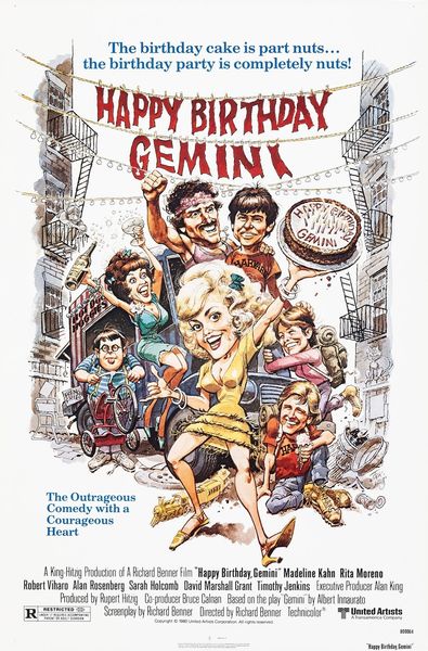
poster
#
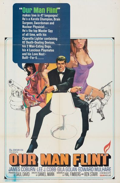
magazine cover
#
caricature
#
figuration
#
pop-art
#
poster
Copyright: Modern Artists: Artvee
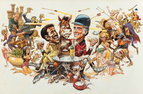
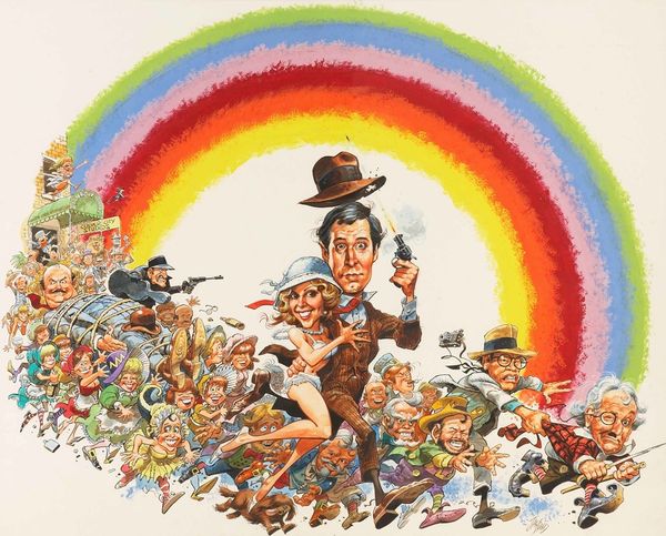
Curator: So, this is Jack Davis’ poster for the 1969 film *Some Kind of a Nut*. It's clearly designed as advertising. What grabs you about it? Editor: Well, right away it feels really busy, almost chaotic. It is Pop Art style for sure. There's a really striking, almost manic energy coming from all the figures, but especially from Dick Van Dyke's exaggerated features. What strikes you about the material choices? Curator: Consider the poster as a commodity. Its purpose isn't just aesthetic; it's a mass-produced object designed to generate interest in the film. The bright colors and caricatured figures – observe the stark contrast of counterculture imagery clashing against mid-century businessmen - are all deliberately employed to grab attention amidst other competing advertising materials. It provokes: Whose labor went into the lithography, the distribution? Who paid for the ink? Editor: I guess I hadn't considered the physical act of printing, just the image itself. That’s interesting… Curator: Look closely at the opposing sides. "Beards Forever" versus "Take it off," "Birds and Beads" vs "Law and Alphabetical Order." Davis is simplifying and exaggerating divisions that played out across the USA and elsewhere. Does this film embrace or critique the conflict? That poster is pure persuasion. What kind of message is being sent by its creation and display, and who does it appeal to? Editor: So, understanding its material conditions, from the printing process to the cultural climate, it is integral to truly ‘seeing’ the poster’s message. Thanks, I appreciate that insight. Curator: And hopefully, you realize now that everything, even the most seemingly straightforward image, is a product of its time, a record of social and economic factors.
Comments
No comments
Be the first to comment and join the conversation on the ultimate creative platform.
More like this