graphic-art, print, paper, typography, poster
#
graphic-art
#
art-nouveau
# print
#
paper
#
typography
#
poster
Dimensions: height 298 mm, width 214 mm, thickness 8 mm
Copyright: Rijks Museum: Open Domain
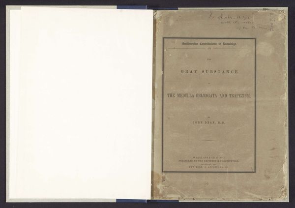
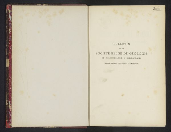
Curator: Here we have an early bulletin cover for “Le Cercle l’Effort,” dating from 1901-1902. The Cercle L’Effort was a Belgian art group in the Art Nouveau style; their poster art evokes the period. Editor: I'm immediately drawn to the simplicity and starkness. The composition, despite the symmetry, feels… fragile, almost melancholic. It seems such a humble format, given the ambitions one associates with the Art Nouveau period. Curator: Art Nouveau was fascinating in that way—how it engaged a diverse range of cultural elements from organic motifs, stylized floral patterns to complex social structures. Note that they put “L’Effort” centrally. This emphasis speaks to a certain aspirational mindset, indicative of early modernist values where individual efforts collectively contribute to progress. Editor: I notice that the page isn’t uniformly ivory, that the discoloration, especially down the center binding, has this quality to it, and contributes to that air of fragility I picked up on initially. The typography itself is austere for its time, though its considered design is of the era. There is a sort of minimalist grid supporting everything in this spread. Curator: Yes, these bulletins acted as key vehicles in disseminating avant-garde ideas. Their format provided a platform for articulating artistic and social ideals. This object, simply designed as it is, signals a cultural push, one that still echoes through the decades. Editor: Agreed. It’s almost ironic how something intending to embody such radicality manifests with such formal reserve. The cover anticipates the later rejection of pure ornament, doesn’t it? It foreshadows shifts that lead to the modern typographical idiom of mid-century design. Curator: Indeed. By appreciating such images and styles in a symbolic sense, we are in turn provided with a powerful insight into how various aesthetics came to form our contemporary visual vocabulary and continue to inform modern ideas of progress. Editor: For me, I am struck by how looking closer allows you to realize how much a form like this—which on the surface seems straightforward—harnesses layers of complex visual thought. A remarkable reminder for why form matters.
Comments
No comments
Be the first to comment and join the conversation on the ultimate creative platform.
More like this