Dimensions: height 180 mm, width 120 mm
Copyright: Rijks Museum: Open Domain
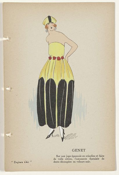
Editor: Here we have "Toujours Chic Les Deshabilles, Hiver 1921-1922: Capricieuse," a watercolor piece. What immediately strikes me is the bold use of the yellow juxtaposed against the stark black belt and swirling gray patterns. It’s so striking! What elements of this work grab your attention? Curator: Indeed, the contrasting palette is the foundation of the work's success. Observe the interplay between the flat planes of color and the delicate lines that define the figure. The artist masterfully uses line weight to create depth, a subtle strategy in this otherwise graphic work. Note, also, the relationship between the organic curves of the dress's embellishments and the sharp angles of her shoes. How do those shapes play off each other? Editor: They almost feel like they're in opposition to each other. The dress feels flowing and feminine, whereas the sharp angles of the shoes give a much more rigid, almost masculine feeling. Curator: Precisely! Consider, further, the surface quality of the watercolor itself. The translucence allows for subtle variations in tone, giving a luminous quality, a key feature of formalism to appreciate materials. Does this luminosity soften or sharpen the contrast? Editor: Soften, definitely. It's like it's bringing the edges together in a gentle haze. Curator: It demonstrates that contrasting shapes are softened via lighting and form to produce depth using delicate materials. The medium of this artwork is truly amazing. Thank you for your keen observation and contributing that unique lens, together we understood it further. Editor: It was a pleasure; I certainly understand more now.
Comments
No comments
Be the first to comment and join the conversation on the ultimate creative platform.
More like this