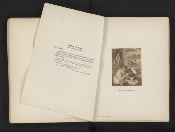
Catalogue of the valuable collection of works of art, sculpture, decorative furniture, and old french tapestry, silver and silver-gilt plate, jewels and bijouterie, of Christopher Beckett Denison 1885
0:00
0:00
#
aged paper
#
paper non-digital material
#
paperlike
#
personal sketchbook
#
folded paper
#
thick font
#
letter paper
#
paper medium
#
historical font
#
columned text
Dimensions: height 263 mm, width 170 mm, thickness 39 mm
Copyright: Rijks Museum: Open Domain
Editor: Here we have a page from the “Catalogue of the valuable collection of works of art...of Christopher Beckett Denison,” printed in 1885. It's interesting to see an auction catalog presented as a work of art itself, and the layout seems quite deliberate. What kind of cultural associations spring to mind for you when you look at it? Curator: I am immediately struck by the historical context and cultural weight embedded in this page. The font itself speaks volumes – its formality and almost archaic style connect us to a specific era, a time of grand estates and curated collections. The very act of cataloging luxury items creates a narrative, doesn't it? Editor: Definitely. It's creating a record of taste, I guess. How does the typography contribute to this sense of historical memory? Curator: The thick, columned text – almost mimicking illuminated manuscripts – suggests a desire to elevate the mundane function of a sales list to something more significant, even commemorative. Notice how the emphasis on "Works of Art, Sculpture" etc. is laid out: It's more than just information; it’s a proclamation of cultural value. We might ask ourselves, what power dynamics are at play when documenting, preserving, and then selling such items? Editor: That's a great point – thinking about power. The listing itself is interesting...like short descriptions of artworks. It also seems so… distant, now. Curator: Exactly. That sense of distance highlights how tastes, values, and power structures have shifted. But, also, think about the repetition. The catalog format repeats itself through multiple items and sales. What are we meant to remember when formats repeat like that? Editor: So, the format acts like a cultural mirror, reflecting our relationship with art and wealth, then and now. I had not considered the iconographic aspect of the typeface, but it so clearly communicates "historical value." Curator: Precisely. And it invites us to examine how visual symbols perpetuate certain cultural memories and, perhaps, even construct them.
Comments
No comments
Be the first to comment and join the conversation on the ultimate creative platform.
More like this