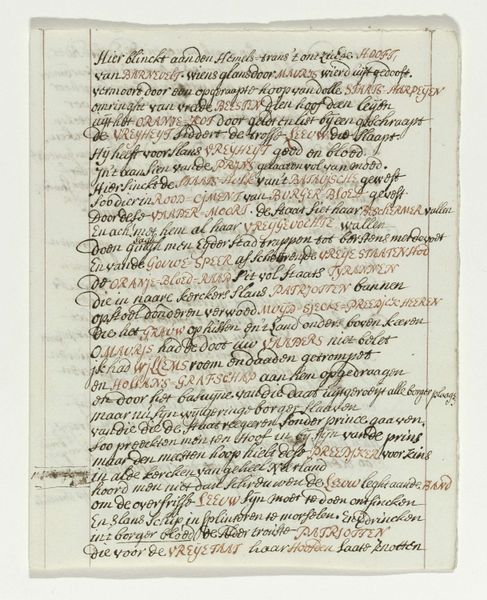
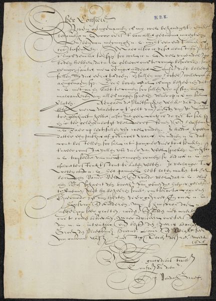
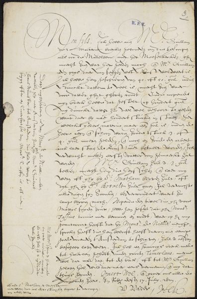
Afschrift van het onderschrift bij de spotprent op de begrafenis van dominee Abraham van de Velde, 14 juni 1677 1675 - 1749
0:00
0:00
drawing, textile, paper, ink
#
drawing
#
baroque
#
old engraving style
#
textile
#
paper
#
ink
#
calligraphy
Dimensions: height 330 mm, width 207 mm
Copyright: Rijks Museum: Open Domain
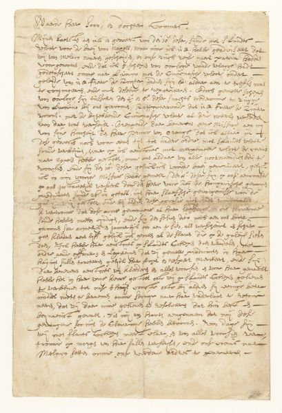
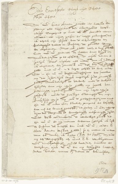
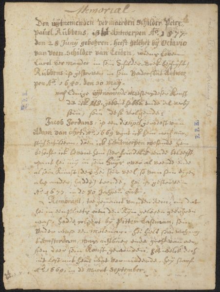
This is a 17th-century Dutch inscription, an anonymous work created with ink on paper. The dominant visual experience is defined by the contrast between the off-white paper and the dense, dark calligraphic script. Note the shapes of the letters; they form a complex network of lines and curves. This overall texture creates a rhythm, a visual cadence that invites the eye to navigate the page. The composition is structured yet organic, lacking rigid symmetry and is instead filled with dense blocks of text arranged in a hierarchy, reflecting the conventions of written documents of the period. This ordering is not merely organizational; it's a semiotic system, where the size and placement of text signify its importance. The script itself is more than just words, it is a visual code reflecting the cultural values of literacy and religious discourse in the 17th century. Consider how the materiality of the ink and paper – simple, readily available – contrasts with the elaborate, almost performative, lettering. This tension underscores the democratization of knowledge during the Reformation.
Comments
No comments
Be the first to comment and join the conversation on the ultimate creative platform.
More like this