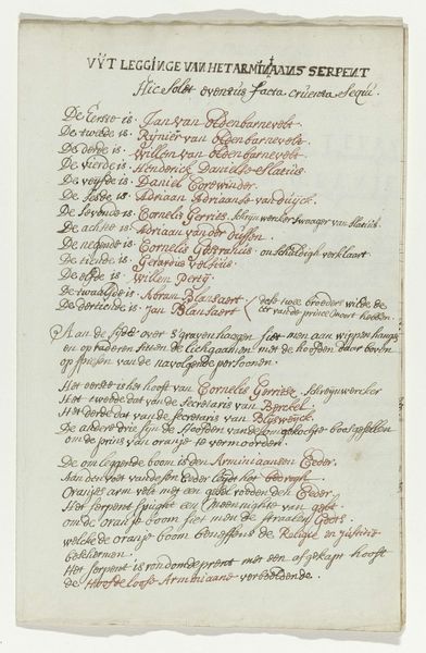
Toelichting bij de tekening van het graafschap van Holland versus Vrije Republiek 1710 - 1720
0:00
0:00
anonymous
Rijksmuseum
drawing, paper, ink, pen
#
drawing
#
narrative-art
#
paper
#
ink
#
pen work
#
pen
#
history-painting
Dimensions: height 207 mm, width 165 mm
Copyright: Rijks Museum: Open Domain
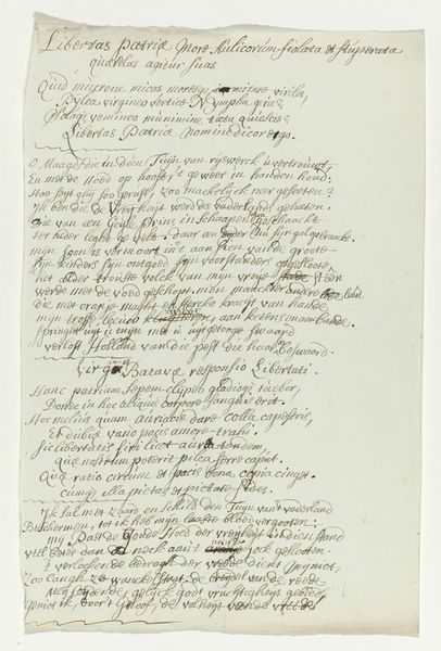
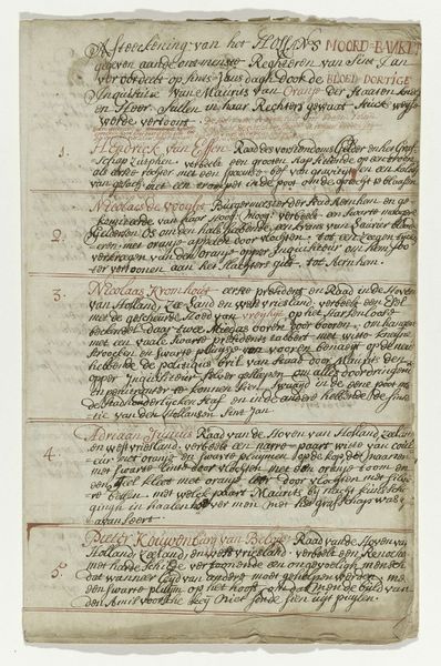
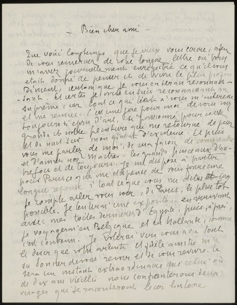
Curator: Ah, yes, this piece catches the eye with its sheer density of script. This is "Toelichting bij de tekening van het graafschap van Holland versus Vrije Republiek," dating from 1710 to 1720, created anonymously. It resides in the Rijksmuseum and is rendered in pen and ink on paper. Editor: It definitely makes a powerful first impression, almost overwhelming with its closely packed lines. There's a dramatic feeling embedded in the dense text, as if I am peering into an urgent, whispered proclamation. Curator: As a historian, I see it reflecting the turbulent political climate of the Dutch Republic at the time. The text appears to be a commentary or explanation related to the conflict between the County of Holland and the Free Republic, a struggle involving power, autonomy, and potentially religious undertones, judging by the mention of preachers. Editor: Indeed. Looking purely at the formal qualities, the lack of any illustrations focuses the entire message into the linguistic structure itself. The use of a quill suggests the physical effort and time invested in transcribing or composing this statement. The contrast of the black ink against the parchment creates a stark dichotomy. Curator: That’s interesting. I would argue that the visual presentation amplifies the text's socio-political charge. The cramped handwriting could indicate secrecy or a desire to disseminate the information quickly. Perhaps this was a broadside or a privately circulated manuscript during a period of heightened tensions. The red lettering, used sparsely, seems to be for emphasis, to make certain phrases stand out in the whole text. Editor: Good eye. I’m noticing the use of particular words that act as anchors; for example, VRYHEYT which seems central. We can almost decode it typographically, discerning points of emphasis and potential counter-arguments merely from the visual layout and rhetorical scheme of the piece. Curator: The Rijksmuseum places it in the context of historical narrative, underscoring its value as a document reflecting the debates of the period, though even in its deliberate illegibility, it preserves some mysteries from this fraught epoch. Editor: From a formalist standpoint, the visual weight of this hand-worked text mirrors the gravity of the historical circumstances it references. Curator: Seeing it from both angles has provided richer context and appreciation, for what this small artwork might have meant.
Comments
No comments
Be the first to comment and join the conversation on the ultimate creative platform.
More like this