water colours
pastel soft colours
possibly oil pastel
fading type
coloured pencil
underpainting
watercolour bleed
watercolour illustration
mixed medium
watercolor
Dimensions: height 125 mm, width 168 mm
Copyright: Rijks Museum: Open Domain
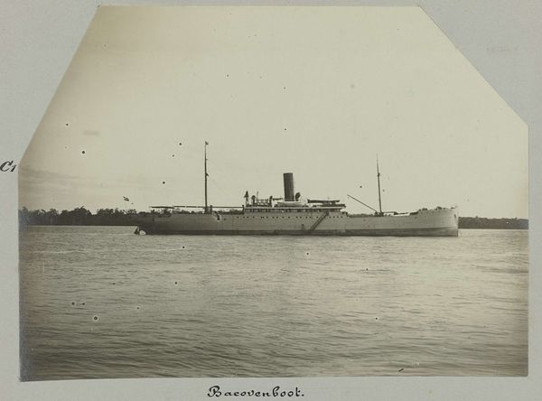
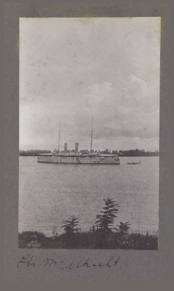
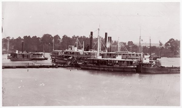
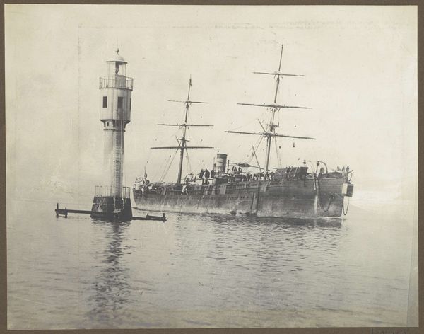
Editor: Here we have Hendrik Doijer’s "Bacovenboot," created sometime between 1903 and 1910, it appears to be mixed media, likely watercolour and coloured pencil. The pastel shades create a faded, almost dreamlike quality. What formal elements strike you in this work? Curator: The immediate compositional arrangement presents a stark horizontal division. The linear form of the ship is strongly emphasized. Observe how the delicate lines defining the ship's structure and the texture of the water create a contrast with the relative blankness of the sky, do you notice this as well? Editor: Yes, I see it. It's quite subtle, isn't it? The ship seems almost suspended in the composition, but the waterline keeps it grounded. Are those choices important to the composition? Curator: Precisely. The artist seems focused on the interplay between form and emptiness. Notice how the vertical masts interrupt the dominant horizontality, providing a counter-rhythm within the structure. One could argue the subdued colour palette is a key formal decision, softening the whole work, while adding a feeling of timelessness. Editor: That’s interesting. It’s more than just a ship portrait; the colours and lines work together to create that sense of time passing. Curator: Exactly! By attending to formal elements, one finds deeper layers of meaning than immediately apparent. We move past what it depicts to what the components create through interaction. Editor: I agree, examining those key decisions illuminates the entire work. Thank you! Curator: Indeed. I hope this experience has widened your critical awareness and has offered a tool for appreciating the more tangible elements in the work before us.
Comments
No comments
Be the first to comment and join the conversation on the ultimate creative platform.
More like this