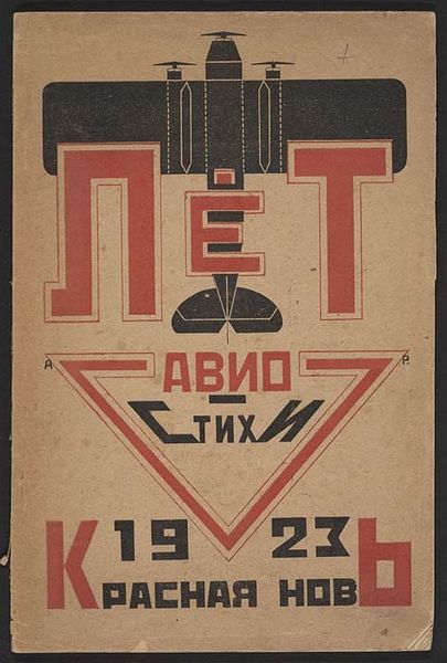
graphic-art, print, typography, poster
#
graphic-art
#
script typography
#
hand-lettering
# print
#
lettering
#
hand drawn type
#
typography
#
hand lettering
#
rayonism
#
constructivism
#
typography
#
eye-catchy type
#
hand-drawn typeface
#
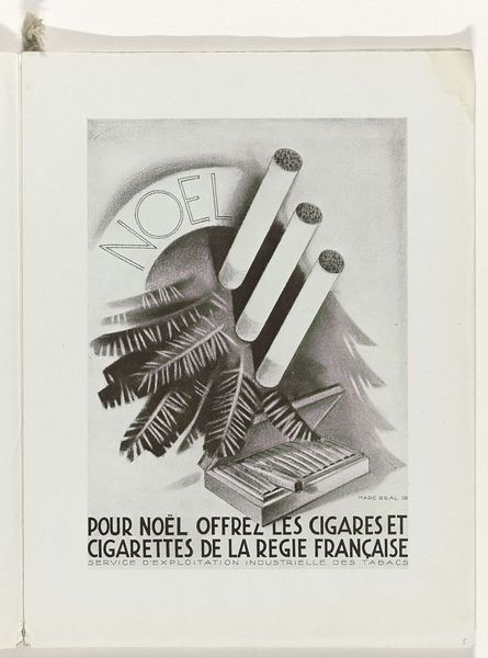
france
#
typography style
#
poster
#
small lettering
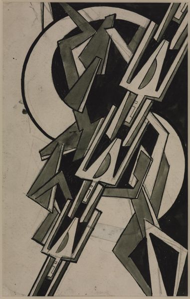
Dimensions: 8 11/16 x 10 5/16 in. (22.07 x 26.19 cm) (image)16 15/16 x 18 1/2 in. (43.02 x 46.99 cm) (outer frame)
Copyright: No Copyright - United States
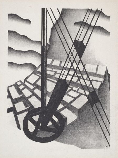
This invitation to the -Grand Bal des Artistes- was made by Mikhail Larionov, probably as a print, but who knows what the original was. I love how the shapes and letters look like they are dancing off the paper. The color is reduced to brown and black, and the figures are reduced to almost nothing: pure blocky silhouettes. And then there are the words, squished and stretched into shapes that are both readable and totally abstract. Look at the figure on the left – is it holding something, or is it being swallowed by a dark form? That kind of ambiguity is what makes art so alive. It’s like Larionov is saying, "Come to the party, but be ready for anything!" It reminds me a little of some of Sophie Taeuber-Arp’s playful abstraction, so energetic and alive. But unlike her precise geometry, Larionov has this amazing looseness and playful quality.
Comments
minneapolisinstituteofart over 1 year ago
⋮
Mikhail Larionov was the lifelong companion of Natalia Goncharova. He ranks prominently as a founder of Rayism. Larionov's invitation was published in tandem with Goncharova's poster Grand Bal de Nuit. The design resembles an illustration by Larionov, published in Vladimir Mayakovsky's The Sun, 1922. Each of Larionov's designs contains some letters from the title; the others can be interpolated from the figures. This concept was inspired by the Zaum ("transitional") literature of the Russian Futurists, in which printed letters are composed to suggest alternative meanings confounding standard syntax and grammar separating sound from immediate sense. Larionov alleged that his use of letters derived from shop signboards.
Join the conversation
Join millions of artists and users on Artera today and experience the ultimate creative platform.
More like this