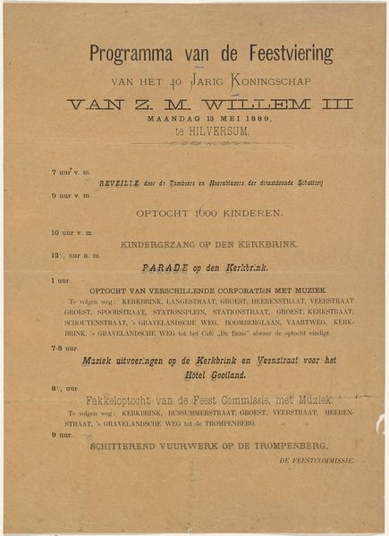
Feestviering bij de Onthulling van het Monument gewijd aan den volksgeest van 1830 en 1831 te Amsterdam op den 25, 26, 27 en 28 augustus 1856 1856
mwestermanzn
Rijksmuseum
print, typography, poster
type repetition
hand-lettering
narrative-art
dutch-golden-age
hand drawn type
hand lettering
typography
hand-drawn typeface
stylized text
thick font
handwritten font
poster
realism
historical font
columned text
Dimensions: height 2240 mm, width 900 mm
Copyright: Rijks Museum: Open Domain
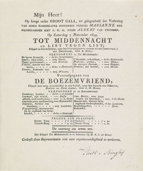
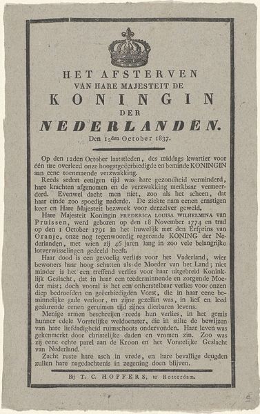
Curator: This print, produced by M. Westerman & Zn. in 1856, documents "Feestviering bij de Onthulling van het Monument gewijd aan den volksgeest van 1830 en 1831 te Amsterdam op den 25, 26, 27 en 28 augustus 1856"—quite a mouthful! It’s a commemorative poster detailing a celebration for the monument honoring the "national spirit" of 1830-31. Editor: My immediate reaction is a feeling of controlled chaos! The typography is wonderfully dense, creating a visually rich and overwhelming effect. It gives me a sense of a huge crowd, bustling energy, all contained within this frame. Curator: I agree; it's a meticulously planned visual overload! Consider the cultural context. 1830-31 were turbulent years in Europe. In the Netherlands, it marked the secession of Belgium. This monument, unveiled 25 years later, was clearly intended to reinforce national identity and unity, a concerted public effort, reflected in every capitalized letter. Editor: Exactly. And look at the visual language employed. The use of heavy, almost gothic fonts speaks to a kind of historical weight, emphasizing the solemnity of the occasion and its connection to past struggles. It serves as a symbolic attempt to fix the narrative in collective memory. Curator: Note how the words 'Onthulling' and 'Monument' are printed in red, drawing the viewer's eye immediately. It's not just a simple announcement, it’s a bold proclamation of civic pride, reinforcing the central idea with a clear, visual emphasis on the monument's significance. What do you make of the columned text? Editor: The layout in columns seems intended to evoke an official document while segmenting the various scheduled festivities. From ‘Opening der Feesten’ to 'Wedstrijd met de Buks,’ it suggests a carefully curated public spectacle. I would be fascinated to understand what that says about how the organizers tried to manufacture collective identity! Curator: Absolutely. And the font choices; from stylized text to more handwritten fonts at the bottom, gives the print the aura of accessibility as well as official documentation, attempting to capture every segment of society. There's so much symbolic information here in the way it’s carefully crafted for cultural impact! Editor: I see your point entirely; the success of such an event probably relied on widespread appeal and participation across many demographics. Examining this poster truly reveals much about public culture during this specific period. Curator: Indeed. What starts as a relatively unassuming print quickly opens up layers of historical meaning. Editor: It just reminds you how typography itself can function as cultural code.
Comments
No comments
Be the first to comment and join the conversation on the ultimate creative platform.