#
white colour balance
#
homemade paper
#
pale palette
#
pale colours
#
light coloured
#
white palette
#
personal journal design
#
pale shade
#
remaining negative space
#
watercolor
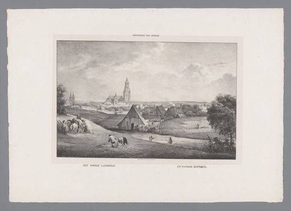
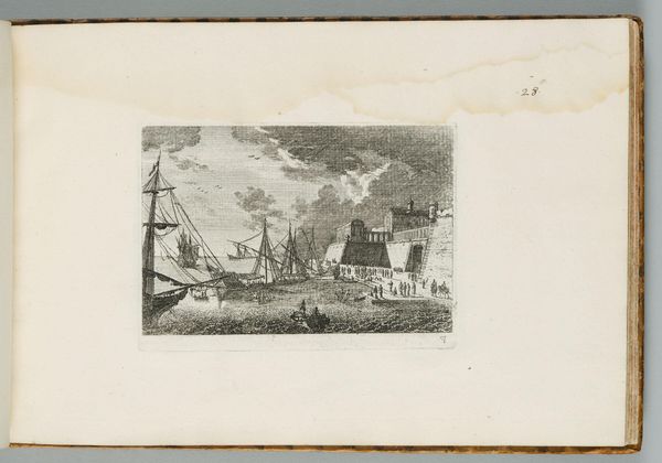
Dimensions: height 310 mm, width 480 mm
Copyright: Rijks Museum: Open Domain
Barend Cornelis Koekkoek made this artwork, "Gezicht op Veere," using etching. The entire composition hinges on tonal contrasts and the interplay between light and shadow. Note how the artist uses a restricted palette to evoke a serene, almost melancholic atmosphere. The composition is structured by a clear division between the foreground and background, anchored by the architectural mass of the city's fortifications. This structure allows your eye to travel, engaging in a visual dialogue between the human-made structures and the natural environment. Consider how this interplay subtly challenges fixed meanings, questioning the relationship between humanity and nature. The sky, rendered with delicate gradations, adds depth and a sense of boundlessness, subtly destabilizing the solid, structured forms below. This element of the sublime contrasts with the more defined, earthly structures. It's this very tension, this inherent instability, that opens up the artwork to ongoing interpretation.
Comments
No comments
Be the first to comment and join the conversation on the ultimate creative platform.
More like this