graphic-art, print, engraving
#
graphic-art
#
neoclacissism
#
script typography
#
hand-lettering
# print
#
old engraving style
#
hand drawn type
#
hand lettering
#
hand-drawn typeface
#
fading type
#
stylized text
#
thick font
#
history-painting
#
handwritten font
#
engraving
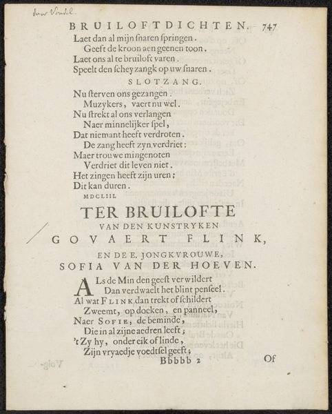
Dimensions: height 215 mm, width 132 mm
Copyright: Rijks Museum: Open Domain
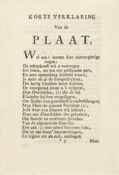
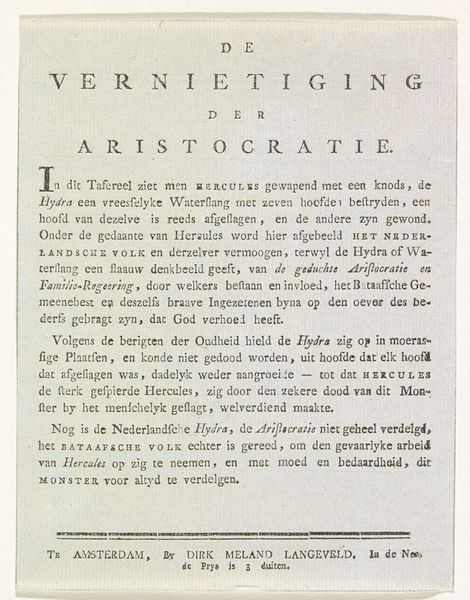
Editor: This is an engraving from 1784, titled "Verklaring van de spotprent op Rijklof Michael van Goens" which translates to "Explanation of the caricature of Rijklof Michael van Goens." It's from an anonymous artist, housed in the Rijksmuseum. The stark black and white and the stylized text create a very intense impression. How would you interpret this work purely from its formal elements? Curator: Initially, the distribution of the text and its varying weights create a visually hierarchical reading experience, guiding our eyes deliberately down the page. Consider the stark contrast between the heavier, blockier typeface of "PLAATJE" and the more delicate, cursive script below. This immediately establishes a tension between the declarative statement and its supporting explanation. How does that interplay influence your perception? Editor: It feels like a clear emphasis on the central image, a kind of visual shouting before whispering the details. What about the white space around the text? Does that contribute to the artwork's effect? Curator: Absolutely. The generous white space, especially considering the density of text, frames and isolates the words. It encourages focused attention on each line, heightening their impact. Observe how the breaks in the lines of text also function as moments of pause, dictating a rhythm to the reading, almost like a musical score. Are you familiar with similar arrangements in other textual prints from the era? Editor: Now that you mention it, I’ve seen comparable typography in other political pamphlets and broadsides. It makes me think about the act of reading, itself. It feels very deliberate, each line carefully placed for maximum effect. Curator: Precisely. And by appreciating these formal strategies, we gain insight into how meaning is constructed visually, independently of historical or social background. The structure is the message. Editor: It's fascinating how the design elements amplify the message. Looking closely at the typeface and spatial arrangement helps you to notice how intentional the design and construction are. Curator: Indeed. A powerful example of how form dictates function, where visual choices construct, and thus influence, the immediate reception.
Comments
No comments
Be the first to comment and join the conversation on the ultimate creative platform.
More like this