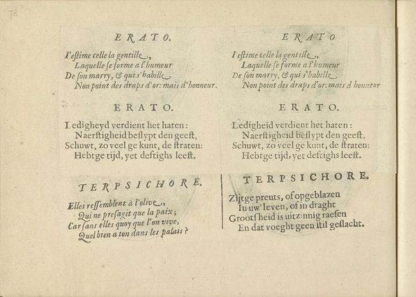
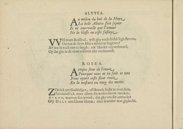
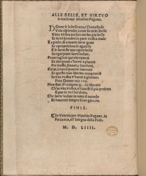
Kwatrijnen bij de voorstellingen van de muzen Calliope en Euterpe 1640
crispijnvandeiipasse
Rijksmuseum
drawing, graphic-art, print, paper, engraving
portrait
drawing
graphic-art
aged paper
hand written
baroque
hand drawn type
hand lettering
paper
personal sketchbook
hand-written
hand-drawn typeface
fading type
sketchbook drawing
sketchbook art
engraving
Dimensions: height 140 mm, width 190 mm
Copyright: Rijks Museum: Open Domain
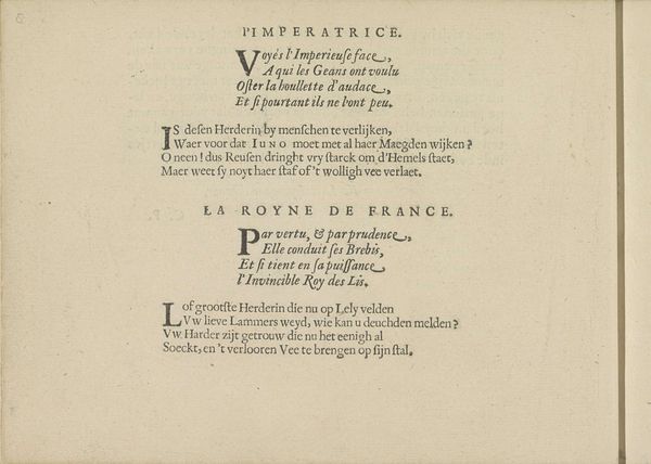
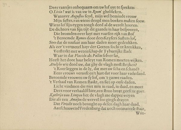
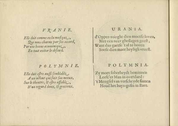
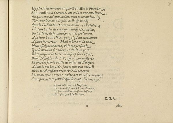
Editor: Here we have "Kwatrijnen bij de voorstellingen van de muzen Calliope en Euterpe," a 1640 engraving by Crispijn van de Passe the Younger, housed in the Rijksmuseum. It’s essentially two facing pages of text, framed within circles, almost like…visual poems. The lettering itself seems very intentional. What catches your eye about this print? Curator: The striking aspect is indeed the graphic treatment of text itself. Note the artist’s rigorous deployment of line – each letterform is built from precisely articulated strokes, creating a dense and visually stimulating field. It operates both as text to be read and as a pure abstraction, a study in texture and form. The deliberate fading and irregularities further underscore this tension between legibility and visual experience. How does this tension impact your interpretation? Editor: I think it makes me consider the weight and presence of words. Like, each phrase isn't just information, but a deliberate mark-making process. Almost sculptural. Curator: Precisely. Furthermore, consider the contrasting orientation and script styles. The intentional use of both French and Dutch text adds another layer to this analysis. Do you feel this difference contributes to the meaning or interpretation? Editor: Definitely. It suggests a broader, perhaps more cosmopolitan audience, and makes me think about the distribution of prints like this during the Baroque period. So, it isn't *just* what is being said but *who* gets to hear it and what the message evokes in different readers. Curator: An astute observation! In terms of formal analysis, what did you think of this work initially? Has your understanding evolved through this conversation? Editor: Absolutely. I went from seeing pretty lettering to considering how language itself is materialized and circulated. Thanks for the insightful directions, seeing this has enhanced my focus on visual aspects. Curator: And I have enjoyed how you brought attention to cultural contexts within such a visibly textual display of early typography.
Comments
No comments
Be the first to comment and join the conversation on the ultimate creative platform.