Copyright: Modern Artists: Artvee
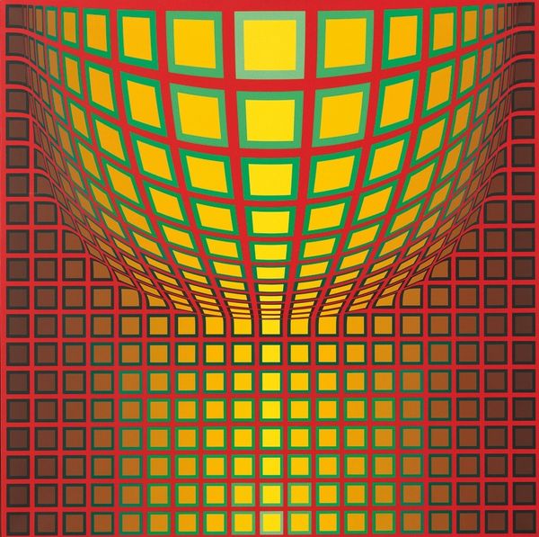
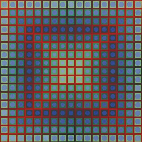
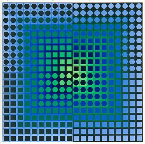
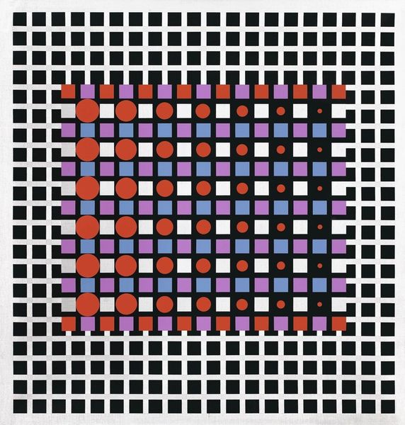
Editor: This is "Bakson," created in 1966 by Victor Vasarely, using acrylic paint. It's a really striking image! All those circles and squares… it almost vibrates. I'm curious, focusing on the arrangement of shapes and the manipulation of color, what stands out to you? Curator: Indeed. Note how Vasarely employs a rigorous geometric structure. The interplay between the circular and square forms, alongside the systematic gradation of color intensity, generates the illusion of spatial depth and movement. This dynamism stems purely from the formal relations within the picture plane. Do you observe how the artist establishes a visual hierarchy through color? Editor: Yes, the reds definitely pop, drawing your eye toward the center, and then those almost-black shapes push it back out again. It’s a push and pull effect. So, the meaning really lies in the formal relationships, not some external reference? Curator: Precisely. One could argue that "meaning," if we insist on the term, is located in the phenomenological experience of viewing. The carefully calculated arrangement provokes a retinal response. Consider how altering the size or value of a single element would disrupt the whole. It is a self-contained system, self-referential, wouldn't you agree? Editor: I see what you mean. It's like a visual equation, where every part needs to be precisely where it is to achieve the overall effect. This piece definitely exemplifies how powerful pure form can be. Thank you! Curator: It has been a pleasure to share observations on its visual rhetoric. I agree – a striking example of pure visual experience.
Comments
No comments
Be the first to comment and join the conversation on the ultimate creative platform.
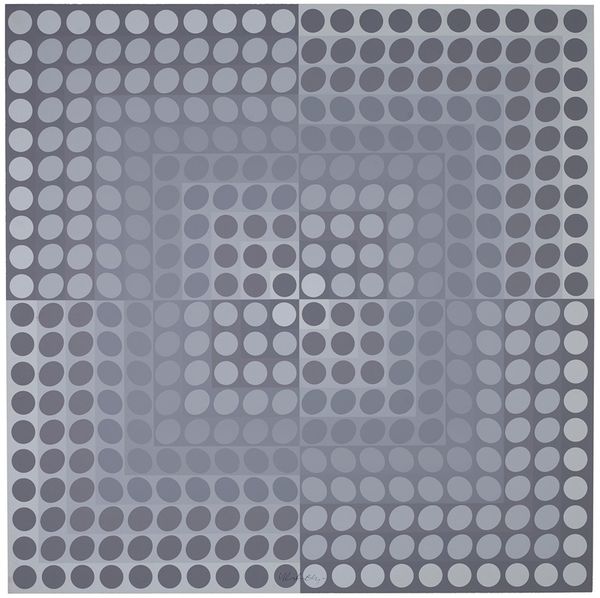
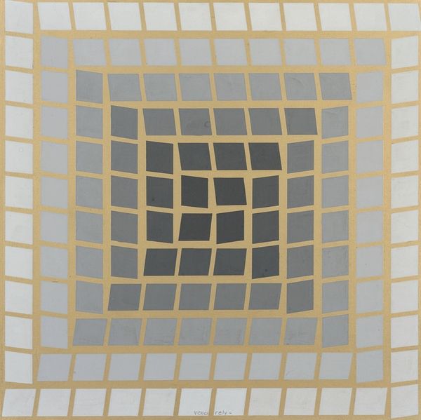
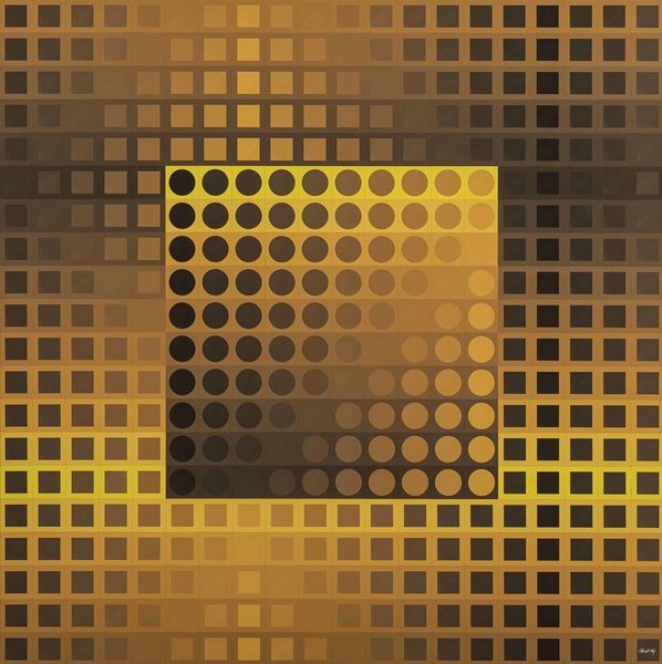
More like this