drawing, paper, ink
#
drawing
#
ink painting
#
dutch-golden-age
#
paper
#
ink
#
calligraphy
Copyright: Rijks Museum: Open Domain
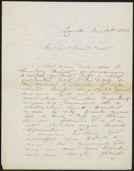
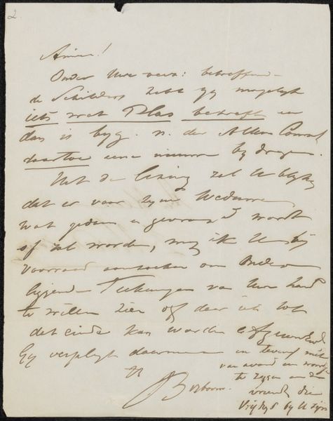
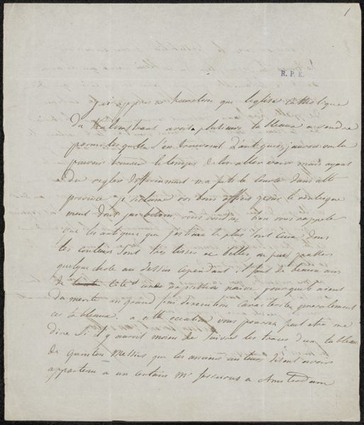
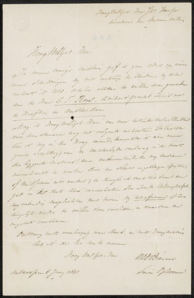
Johannes Bosboom penned this letter to Johannes Godefridus Frederiks in 1860, using ink on paper. The visual impression is one of dense script filling most of the page, a stark contrast between the dark lines of the writing and the pale background, evokes a sense of immediacy and personal connection. Bosboom's use of line is particularly striking. The strokes vary in thickness and pressure, creating a dynamic rhythm across the page. This is not merely a functional aspect of writing; it brings an expressive, almost calligraphic quality to the letter. Consider how the formal elements of handwriting—the loops, the slants, and the overall arrangement—play with the conventions of written communication. Bosboom destabilizes the traditional formality of letter writing through his unique style. In structuralist terms, the letter operates as a system of signs. Each word is a signifier that points to a signified, yet the handwriting adds another layer of meaning. The aesthetic presentation and the formal qualities of the handwriting are intrinsically linked to its content. We are left to ponder the relationship between form and content, and how Bosboom's aesthetic choices challenge our expectations of communication.
Comments
No comments
Be the first to comment and join the conversation on the ultimate creative platform.
More like this