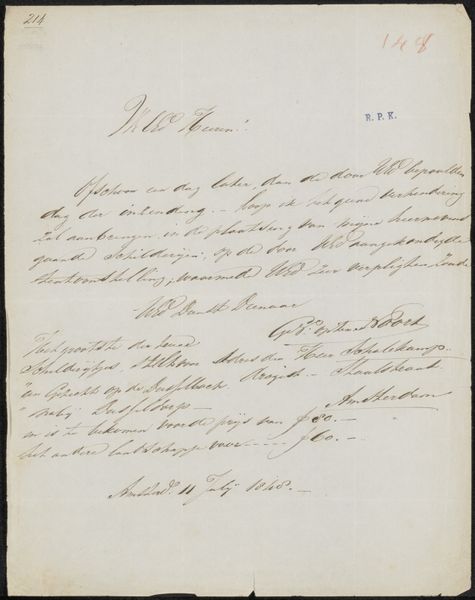
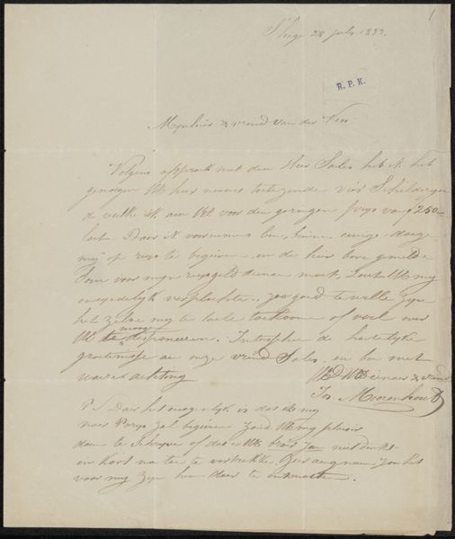
Brief aan de commissie van de Tentoonstelling van Levende Meesters in Utrecht Possibly 1848
drawing, paper, ink, pen
drawing
dutch-golden-age
paper
ink
pen
Copyright: Rijks Museum: Open Domain
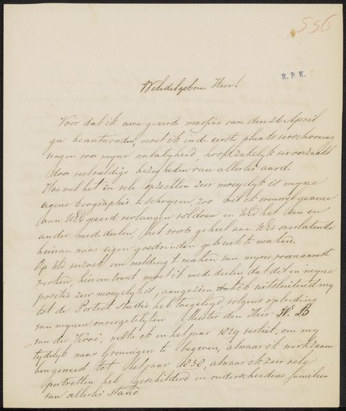
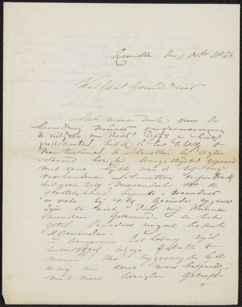
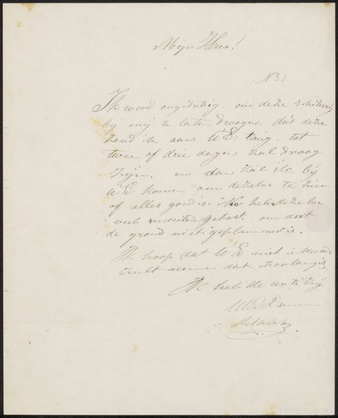
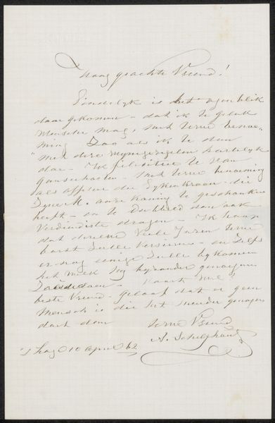
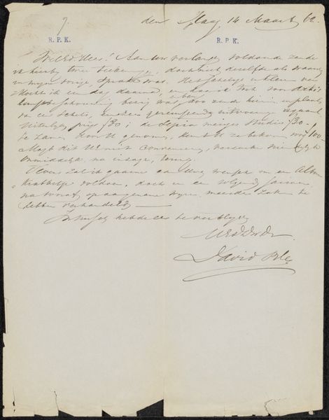
Curator: Today, we're looking at "Brief aan de commissie van de Tentoonstelling van Levende Meesters in Utrecht" or, "Letter to the commission of the Exhibition of Living Masters in Utrecht," possibly from 1848, penned by Christiaan Lodewijk Willem Dreibholtz. It’s a drawing done in ink on paper. Editor: It has such beautiful script, really lovely calligraphic flourishes. The shades and textures created by the ink give the impression of age. Curator: Absolutely. Dreibholtz addresses the commission concerning the possible acceptance of a painting depicting ships on the Scheldt River, one of the great waterways running through the Netherlands, Belgium, and France. What interests me is what the letter can reveal about the networks and gatekeepers that determined artistic success at the time. He proposes a value of 860, a not inconsiderable sum. Editor: So even in this type of functional document we can decode something beautiful from the line weights, and elegant letterforms—the s's in particular catch my eye—and also how the page is visually divided in relation to its words. There’s a kind of asymmetry created that is very appealing, almost reminiscent of a landscape. The handwritten aspect gives it a human dimension, especially compared to standardized font types of today. Curator: Right. Letters like this, seemingly administrative on the surface, were integral to an artist’s livelihood and standing in the artistic community. Who you knew, how well you could write and advocate for yourself - these things shaped one's prospects and professional acceptance in Dutch society. This letter signifies artistic negotiations and the economic realities of the era. It wasn't always about genius alone, but networks of power. Editor: And understanding the ways in which that period shaped an author’s approach helps in better decoding those decisions—especially concerning composition. I initially took the beauty of the hand-writing for granted, but that approach is shortsighted: even such subtle design choices carry significance when evaluated within that era’s artistic and societal values. Curator: Yes, the letter showcases how deeply intertwined art and social systems were in the Netherlands at the time. Editor: And it’s always beneficial to see the ways structure and context can complement each other—leading to surprising results.
Comments
No comments
Be the first to comment and join the conversation on the ultimate creative platform.