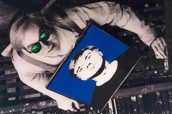
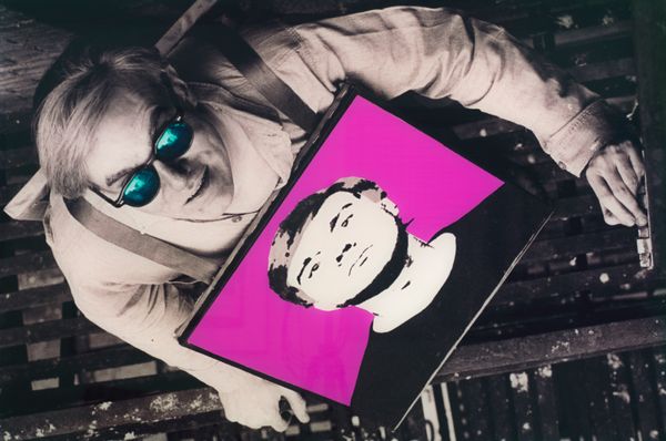
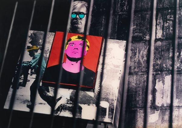
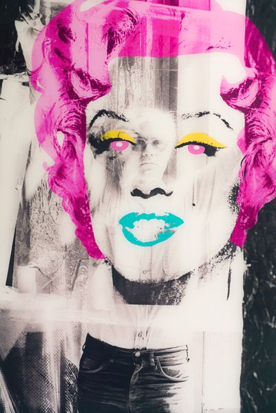
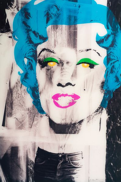
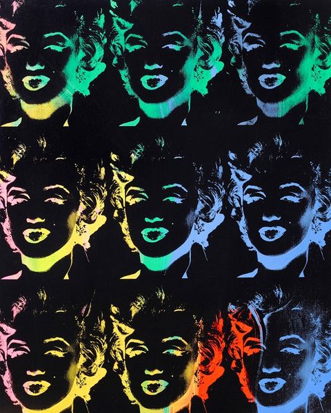
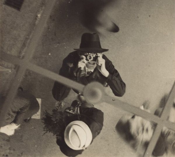
Editor: This piece, titled "Colour Experiment 2" by William John Kennedy and housed here at The Art Flat, strikes me as a fascinating study in contrasts. The almost harsh yellow clashes intriguingly with the black and white tones surrounding it. How do you interpret this kind of bold colour play? Curator: For me, this piece is an exercise in controlled chaos. I sense Kennedy inviting us to reconsider our understanding of colour's impact and emotional weight. Do you see how the bright yellow acts almost as a jolt? And why does it cradle a portrait, no less? The contrast heightens both the starkness and the underlying human element. Are you reminded of Warhol, maybe? Editor: Absolutely. The portrait's pop art feel combined with such strong hues reminds me of some of his prints. I'm intrigued by how the artist positions themselves in the shot – viewing the artwork, perhaps even creating it. Curator: Precisely. It's like Kennedy wants to blur the lines, the creative process becoming the subject itself, almost mocking us with its directness. Is it pretentious, perhaps? Or profoundly sincere? Editor: I'm swaying toward sincere. The piece doesn't shy away from vulnerability, almost playfully so. Curator: Right? Perhaps its awkwardness IS its power, capturing that messy, in-between stage where creation comes to life. Something quite exciting, then. It encourages me to embrace the off-kilter angles and imperfect compositions in art – and in life! Editor: That’s beautifully put, bringing a sense of liberation into what can initially appear like a daunting or perplexing work of art.
More like this