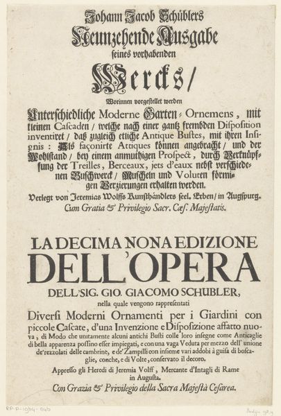
Johann Jacob Schüblers Sechzehende Ausgabe seines vorhabenden Wercks, Worinnen vorgezeigt werden Sechs Neu-inventirte Vases (...) after 1724
0:00
0:00
graphic-art, print, typography
#
graphic-art
#
baroque
# print
#
typography
Dimensions: height 410 mm, width 262 mm
Copyright: Rijks Museum: Open Domain
Curator: We’re looking at a print titled "Johann Jacob Schüblers Sechzehende Ausgabe seines vorhabenden Wercks, Worinnen vorgezeigt werden Sechs Neu-inventirte Vases (...)," made after 1724. It’s currently held in the Rijksmuseum. Editor: Immediately, I notice the density of the typography. It almost feels like a wall of text, broken up by these elaborately decorated initial letters. It gives it a strong, almost oppressive presence despite its size. Curator: Precisely. The Baroque style is evident in that ornamentation. And the fact that the same advertisement is written in two languages, a German version, and an Italian one below. Editor: Are those the languages of the main regions that his prints were popular in at the time? It would explain the density because he essentially had to make sure to reach all interested markets at once. Curator: It seems to be for commercial intent as it has the words, "Verlegt von Jeremias Wolffs Kunsthändlers," indicating it was published by the dealer Jeremias Wolff. It highlights the commodification of art and the growing market for prints during this period. Consider that Jeremias' heirs even took over the publishing business in Augsburg when he passed. Editor: What's striking is the almost assertive visual rhetoric employed through varied typefaces, sizes, and the contrast between black ink and white paper. Semiotically, one could decode it as a direct appeal to potential buyers, using boldness and stylistic flair to cut through the visual noise of the era. It seems so confident for being a rather mundane commercial tool, and the claim of "new invention" really reinforces its position as propaganda in the 18th century art world. Curator: And the Latin phrases, “Cum Gratia & Privilegio Sacr. Cæs. Majestatis" show the important and complicated ties between the business world and the Imperial governance of the time. Editor: Overall, considering the artwork details really reframes my initial view of "oppressive density" into calculated commercial strategy, showing me how the physical design elements really contribute to its economic success. Curator: I find how the typography embodies a historical moment when art production and commerce were intertwined, each promoting and sustaining the other.
Comments
No comments
Be the first to comment and join the conversation on the ultimate creative platform.
More like this