print, typography, engraving
# print
#
11_renaissance
#
typography
#
engraving
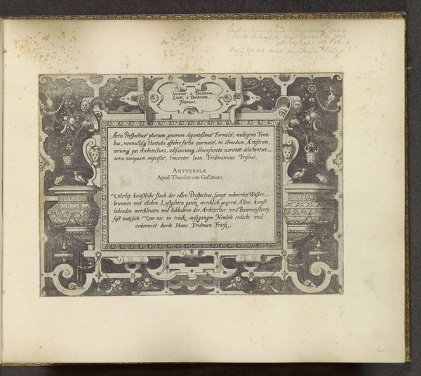
Dimensions: height 259 mm, width 193 mm
Copyright: Rijks Museum: Open Domain
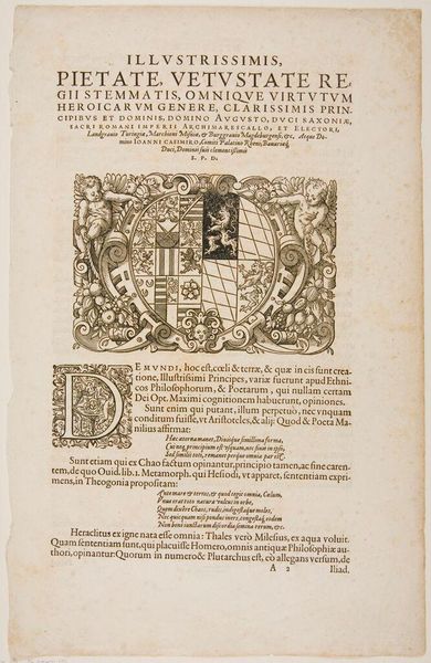
Curator: We’re looking at the title page for the series Kleine Landschappen, or Small Landscapes, created by Hieronymus Cock between 1559 and 1561. It's an engraving with typography. What’s your immediate reaction to this work? Editor: It's like peeking through a very ornate, almost overwhelming keyhole. I get this odd sensation of compressed energy, all these meticulous details fighting for space. It feels… scholarly but also secretive, doesn't it? Curator: I find that description apt. Notice the meticulous execution, typical of Cock's workshop. The typography, with its dense arrangement and varied fonts, establishes a hierarchical visual structure, effectively drawing the eye down the page. Consider the formal qualities, especially the borders adorned with repeated motifs, almost obsessive in their intricacy. Editor: Right, it’s this claustrophobic embrace of ornamentation! But there's something very human about it, maybe even playful? Like, he’s saying, "Come closer, decode this. I dare you." There is a definite feeling that the work is also acting as a sales tool. Curator: Yes, this serves as an invitation to a suite of landscape prints, showcasing Cock's acumen as a publisher. It demonstrates the economic intersection of art and commerce, catering to a burgeoning market for collectible prints during the Renaissance. The inclusion of "Cum gratia et privilegio Regis" suggests both royal sanction and protection against unauthorized reproduction, a legal claim in early printmaking. Editor: Thinking about the actual "small landscapes" this page introduces—tiny worlds reproduced and disseminated. It's a weird echo of how we experience images now, no? This distillation of place, this idea of possessing a view. So, beyond just seeing skilled engraving and classic typography, there’s almost a playful intellectual depth being advertised as part of the product, it promises an immersion in learning about places through pictures. Curator: A prescient observation. We might interpret this title page as an early form of branding, shaping our experience of the ensuing landscapes and signaling both artistry and knowledge. It makes an elegant use of limited pictorial space, too. Editor: For me, the lasting impression is that it offers not only art and knowledge, but an almost overwhelming density. The frame, the dense type, everything fights for space in a visual statement almost desperate to suggest the rich landscape it protects within.
Comments
No comments
Be the first to comment and join the conversation on the ultimate creative platform.
More like this