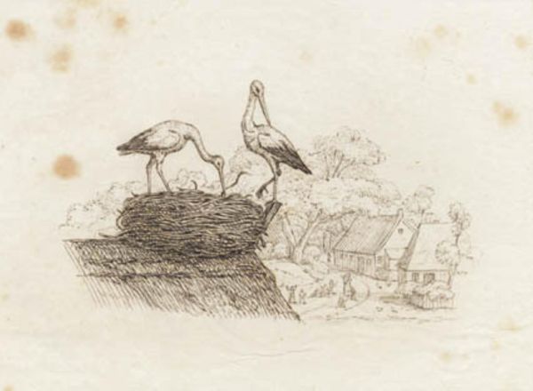
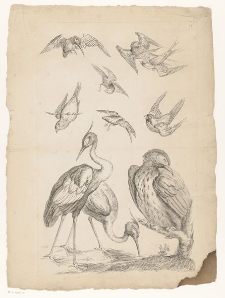
Illustration til "Halvhundrede Fabler for Børn" af Hey 1834
0:00
0:00
drawing, print, engraving
#
drawing
# print
#
landscape
#
line
#
engraving
Dimensions: 107 mm (height) x 133 mm (width) (bladmaal)
Editor: Here we have Martinus Rørbye’s 1834 print, “Illustration til "Halvhundrede Fabler for Børn" af Hey," currently housed at the SMK. It’s a delicate engraving dominated by line work. The image shows two storks tending to their nest, set against a backdrop of quaint buildings. The fine lines and overall sepia tone create a feeling of stillness, almost like a faded memory. What catches your eye when you look at it? Curator: Formally, the interplay between the graphic precision of the lines and the relative openness of the composition is immediately striking. Note how the hatching defines form and texture, particularly in the rendering of the nest and the thatched roof. The varying densities of line create a sense of depth, pushing the background further into space. This piece is not just about what is depicted but also about *how* it's depicted. Do you notice any contrasting elements in the composition? Editor: I do see that the foreground feels very dense and textural, with all the lines creating the nest, and then the background is more sparse. Curator: Precisely. The contrast highlights the storks' domain versus the human world beyond. We should consider that line engraving, a demanding process, enabled Rørbye to achieve a remarkable level of detail. How might that impact our understanding? Editor: Perhaps it shows a dedication to capturing the specifics of the natural world and rural life? Almost scientific in its observation? Curator: Exactly. It signifies his keen observation translated with high technical skill, all through close examination of form and texture. Through formal analysis, we can begin to discern not just the *what*, but the *how* and the *why* of its making. Editor: This has completely changed how I view this work, what I saw as a charming fable is the artist deliberately drawing contrasts in the rural life! Curator: Indeed, that’s the power of focusing on the formal properties and material qualities. It's an invitation to explore the depths of artistic intention through its execution.
Comments
No comments
Be the first to comment and join the conversation on the ultimate creative platform.
More like this