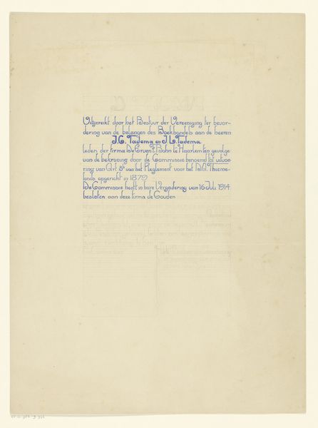
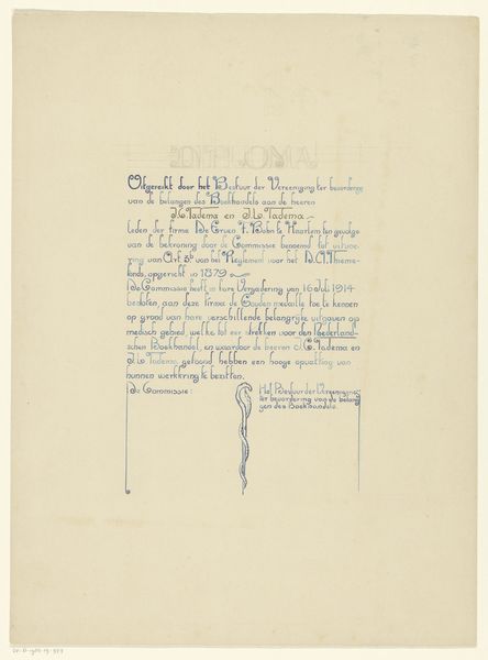
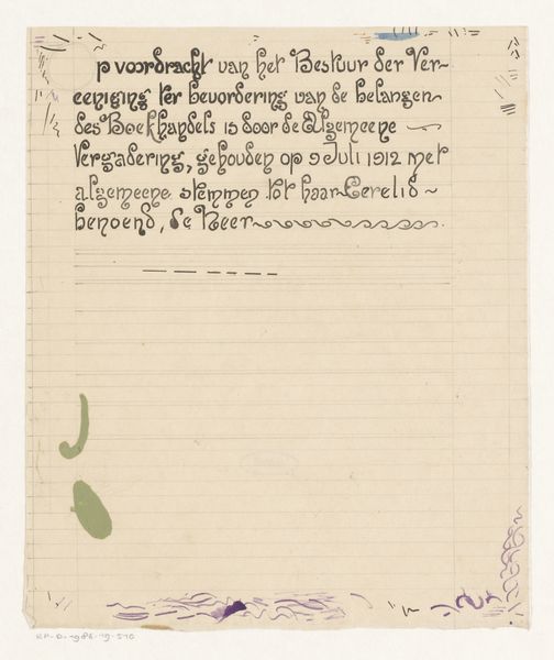
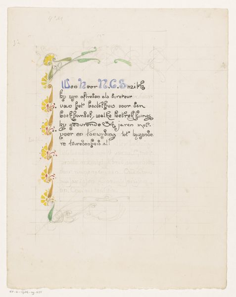
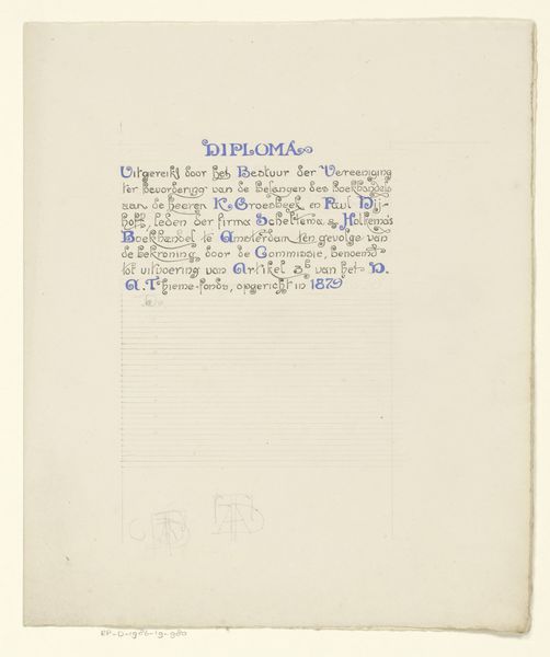
Ontwerp voor een oorkonde van de Vereniging ter Bevordering van de Belangen des Boekhandels 1912
0:00
0:00
graphic-art, paper, typography, ink
#
graphic-art
#
art-nouveau
#
paper
#
typography
#
ink
#
calligraphy
Dimensions: height 438 mm, width 302 mm
Copyright: Rijks Museum: Open Domain
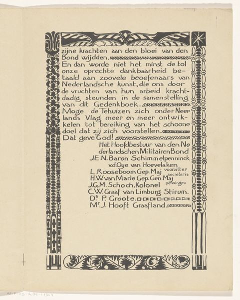
This is a design for a certificate made by Reinier Willem Petrus de Vries in 1912. The lettering is tight, the inky black lines are packed together and interspersed with red and green embellishments. It's the kind of thing where you can tell someone really took their time, you know? I'm interested in the black lettering that fills most of the page. It’s not quite calligraphy, but it has that same meditative quality, like a form of drawing, built up from simple marks to create a complex whole. I feel like I can almost see De Vries building up each letter one stroke at a time. It reminds me of some of the Pattern and Decoration artists from the 70’s, people like Joyce Kozloff or Robert Kushner, who used repetition and detailed ornamentation as a way to celebrate craft. De Vries reminds me of William Morris and the Arts and Crafts movement, with a similar belief in art as a form of skilled labour and an accessible, democratic practice. For me, this piece is a demonstration of how the simplest materials, ink and paper, can be elevated through care and attention.
Comments
No comments
Be the first to comment and join the conversation on the ultimate creative platform.
More like this