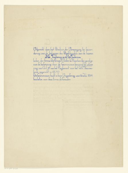
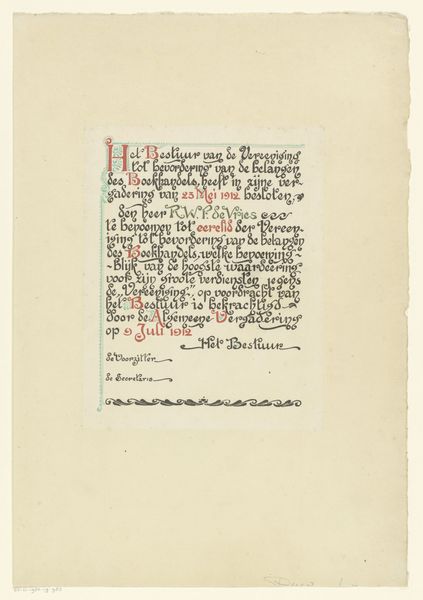
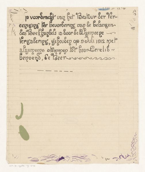
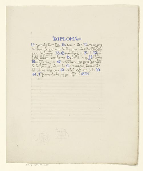
Ontwerp voor een diploma van de Vereniging ter Bevordering van de Belangen des Boekhandels 1914
0:00
0:00
drawing, graphic-art, print, paper, typography, ink
#
drawing
#
graphic-art
#
art-nouveau
#
ink paper printed
# print
#
hand drawn type
#
paper
#
typography
#
ink
#
fading type
Dimensions: height 434 mm, width 321 mm
Copyright: Rijks Museum: Open Domain
Curator: Here we have Reinier Willem Petrus de Vries' "Ontwerp voor een diploma van de Vereniging ter Bevordering van de Belangen des Boekhandels," created in 1914. It’s a fascinating example of graphic art. Editor: My initial thought? Elegant, but also a bit... bureaucratic? There's something about the meticulous linework combined with the formal layout that feels both beautiful and quite serious. Curator: Indeed. De Vries, working within the Art Nouveau style, often brought a refined touch to commercial designs. This is ink on paper, intended as a printed certificate for the Association for the Promotion of the Interests of Booksellers. Look at the gorgeous typography, even in this design phase. Editor: Exactly! That's where the interest lies for me. In thinking about this diploma, a certificate of achievement, in terms of access to literary spaces. Who were these booksellers, what kind of books were they selling, and who had access to them? What voices and histories might they have promoted, or suppressed? This becomes an entry point into wider societal questions about literacy and power. Curator: I love that reading. I see the Art Nouveau flourishes as less purely decorative and more as a statement. To me the stylized serpentine element anchoring the text offers both elegance and a sense of established, historical importance to bookselling as a profession. Editor: True, but doesn’t it also speak to the restrictions and structures that formal awards impose? While the serpentine detail might aim for elegance, the lines framing the central text look severe in holding the information to this space. Curator: It's a good tension. Ultimately, though, for me, it represents a beautifully rendered artifact of a specific time and place. This speaks to both an era and also of artistic commitment. It elevates a practical document through deliberate artistry. Editor: And for me, it’s an invitation to unpack the hidden meanings of a seemingly straightforward certificate and consider the bigger picture—how knowledge and recognition are circulated, and whose stories get told. Curator: That push and pull is what keeps art exciting! A fusion between something created long ago and a still impactful message.
Comments
No comments
Be the first to comment and join the conversation on the ultimate creative platform.
More like this