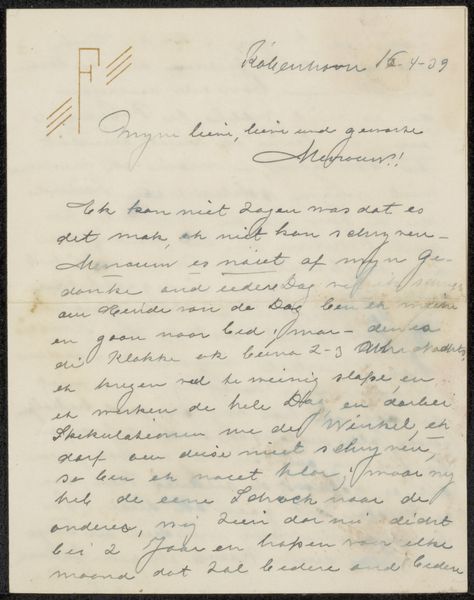
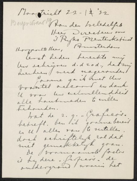
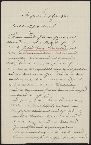
drawing, paper, ink
#
portrait
#
drawing
#
paper
#
ink
#
calligraphy
Copyright: Rijks Museum: Open Domain
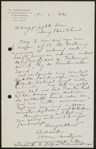
Curator: Today, we're examining "Brief aan jonkheer Hendrik Teding van Berkhout (1879-1969)", a drawing possibly from 1932 by Henri Verstijnen. It combines ink and paper, showcasing the elegance of calligraphy. Editor: It gives a somewhat melancholic impression, almost spectral, owing to the cursive handwriting and muted tone of the ink on the aged paper. It whispers of bygone days and forgotten correspondence. Curator: From a formalist perspective, consider the careful construction. Verstijnen meticulously arranges text to create visual rhythm. The variations in line thickness and the spacing between words contribute to the piece's overall compositional balance. Editor: However, beyond its visual appeal, think about the context of letter-writing in the 1930s. It represented formal social conventions and power dynamics. A "jonkheer" signifies nobility, implying a hierarchical relationship with the writer, Verstijnen. What social and political motivations underpinned this correspondence? Curator: Indeed, the very act of writing, particularly in a beautiful calligraphic style, elevates the correspondence to an art form. Note the careful looping of ascenders and descenders and the flourishes with the pen's movements. Editor: Let's also address issues of access and privilege tied to literacy. Who had the leisure and education to create such a refined piece of writing? It hints at broader socio-economic divides in that era, wouldn't you agree? This single page contains a world of meanings reflecting its society. Curator: I find the attention to line and form—its deliberate aesthetic—a testament to the creative possibility embedded within the constraints of letter-writing tradition. Editor: I see the remnants of a specific exchange and also reflections of past values still resounding within contemporary society. It all becomes visible in just one document.
Comments
No comments
Be the first to comment and join the conversation on the ultimate creative platform.
More like this