drawing, paper, ink, pen
#
portrait
#
drawing
#
hand-lettering
#
hand drawn type
#
hand lettering
#
paper
#
personal sketchbook
#
ink
#
hand-drawn typeface
#
ink drawing experimentation
#
pen-ink sketch
#
pen work
#
sketchbook drawing
#
pen
#
sketchbook art
Copyright: Rijks Museum: Open Domain
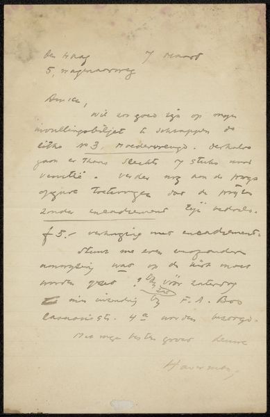
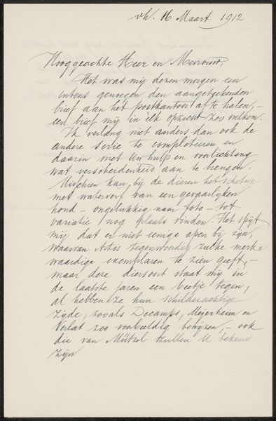
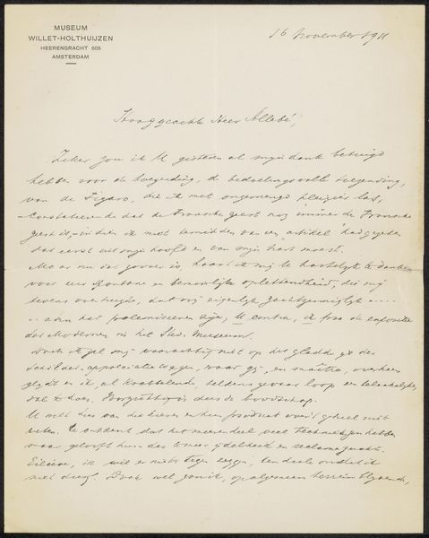
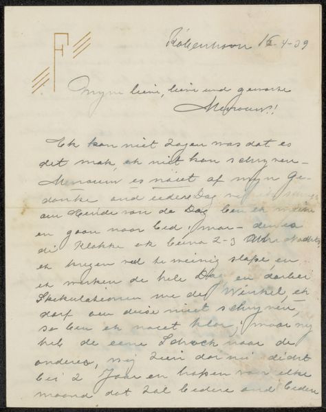
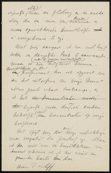
Editor: Here we have "Brief aan Jan Veth" by August Allebé, dating probably between 1907 and 1921. It’s a pen and ink drawing on paper, held at the Rijksmuseum. The overall impression is of intimacy, as though peering over the shoulder of someone writing. What strikes you about the composition and how do you interpret the hand lettering? Curator: What immediately seizes my attention is the interplay between legibility and abstraction. While ostensibly a letter, the function of conveying semantic meaning is secondary to the visual experience. Consider the density of the lines, their varied thicknesses, the rhythmic quality they establish. It's an exercise in pure form. Do you perceive any areas where the letterforms verge on becoming purely gestural marks, divorced from their linguistic purpose? Editor: Yes, especially toward the bottom where the signature becomes more of a flourish. The words become less distinct, more about the rhythm and movement of the hand. Is the artist experimenting with deconstructing language itself? Curator: Precisely. The drawing privileges the aesthetic properties of writing over its communicative function. The very act of writing transforms into a subject of artistic exploration. How does that change your understanding of the "letter"? Editor: It’s like the idea of a letter is present, but it's the shapes and textures, not necessarily the content, that are really important. More about the ‘idea’ of communicating? Curator: A key point, and quite an innovative idea for that period. In formalist terms, the artist’s intention, biographical details even, pale in comparison to what we derive through focused observation and analysis of shape and tone. A lesson indeed. Editor: Thank you, I can now clearly see that approaching this as an exercise in shapes allows a much clearer perspective than its actual contents.
Comments
No comments
Be the first to comment and join the conversation on the ultimate creative platform.
More like this