Copyright: CC0 1.0
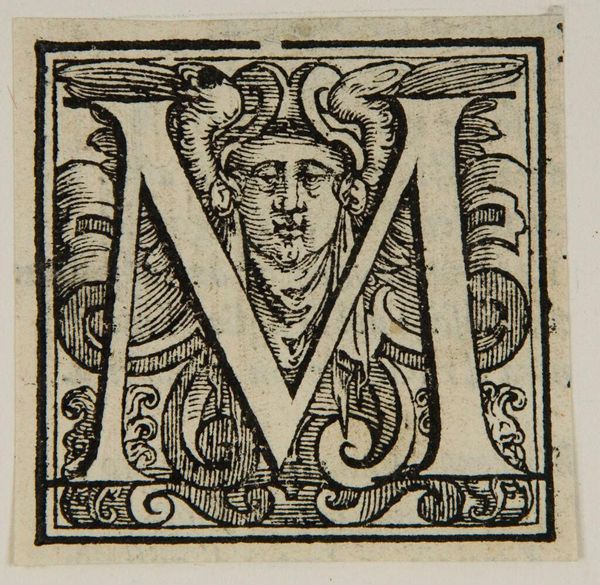
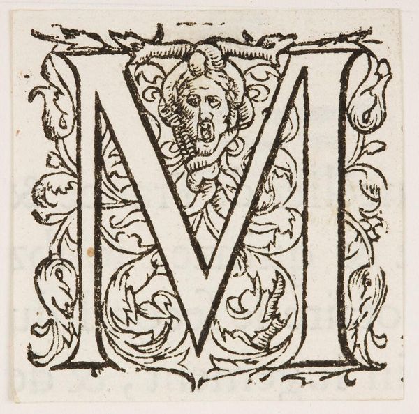
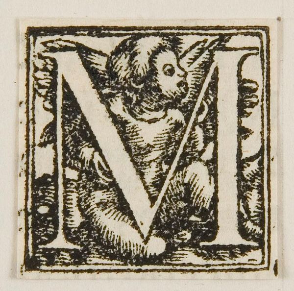
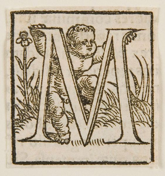
Editor: This is an anonymous print called “Initial M” from the Harvard Art Museums. I'm really drawn to the intricate detail of the lines. What stands out to you in this composition? Curator: The letterform itself, with its clean, geometric strokes, acts as a figure, boldly contrasting the dense, organic ground. Observe how the negative space within the "M" is activated by the floral and figural motifs. Do you perceive any tension or harmony in this interplay? Editor: I see both, actually. The rigidity of the M is softened by the interior designs. I hadn't considered the use of negative space so actively. Curator: Precisely. It reveals how formal elements work to create meaning. Considering this, what might you say about the function and aesthetic purpose of this initial? Editor: I see now how it's both decorative and functional, bridging form and purpose elegantly. Thank you!
Comments
No comments
Be the first to comment and join the conversation on the ultimate creative platform.
More like this