Copyright: CC0 1.0
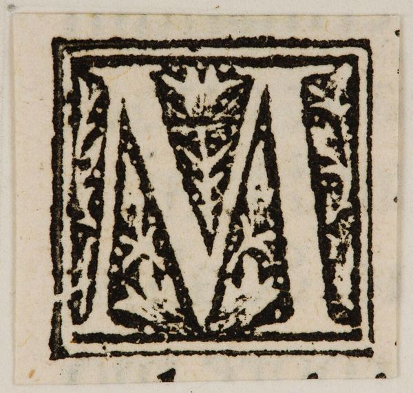
Curator: This initial "M" by Hans Holbein the Younger strikes me as delicate, almost ethereal, despite the sharp lines of the print. Editor: Well, let's consider it formally. The "M" itself provides a strong, stable structure. Holbein places a cherubic figure within its negative space, creating a fascinating tension between the sacred and the secular. Curator: The social context is key here. Initials like these were part of larger illuminated manuscripts, status symbols for a literate elite. This "M" speaks to a time when knowledge was power, literally framed by religious imagery. Editor: Precisely. Note how the ornamentation, though seemingly organic, strictly adheres to the letter's form. Holbein uses the density of line to create areas of shadow, subtly shaping our perception. Curator: And that cherub, a common motif, reinforces the Church's presence in everyday life. It's a reminder of the institution's pervasive influence on even the smallest details of artistic expression. Editor: Ultimately, it's a beautifully balanced composition, a study in contrasts and textures that elevates a simple letter to a work of art. Curator: Yes, observing this artwork through a historical lens really underscores the power dynamics at play.
Comments
No comments
Be the first to comment and join the conversation on the ultimate creative platform.
More like this