Copyright: CC0 1.0
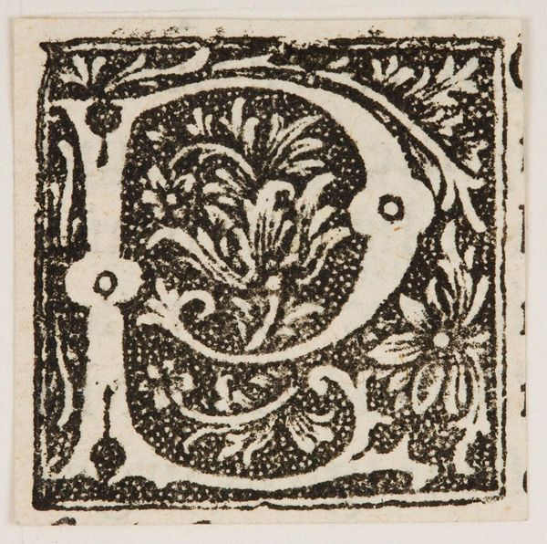
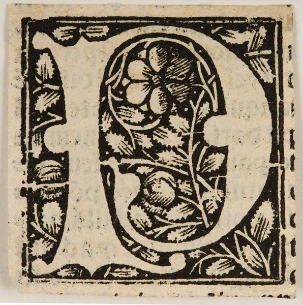
Editor: This is "Letter P," created by an anonymous artist. The blocky textures and graphic use of negative space really make the image pop. What strikes you when you look at this piece? Curator: Note the sharp contrast between the dense black ink and the untouched paper. This contrast isn't merely decorative; it establishes a structural tension. The eye is drawn to the interplay between form and void. Editor: So the stark contrast isn't just aesthetic, it's fundamental to how we perceive the letter itself? Curator: Precisely. Consider also the elaborate floral motifs within the letter. How do these naturalistic elements interact with the rigid geometry of the letterform? Editor: It's a cool juxtaposition. Thanks for making me see beyond the immediate image. Curator: My pleasure. Paying attention to the elements in a piece can really deepen your understanding.
Comments
No comments
Be the first to comment and join the conversation on the ultimate creative platform.
More like this