Copyright: CC0 1.0
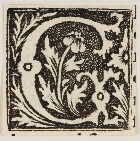
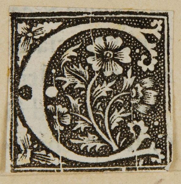
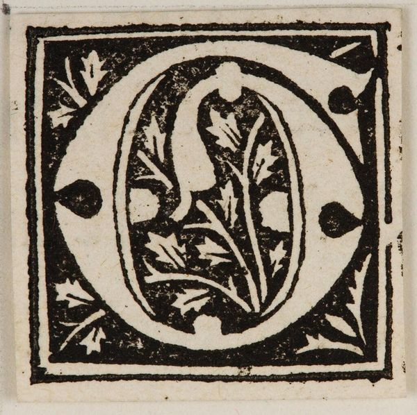
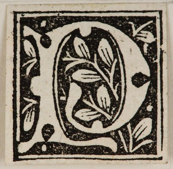
Editor: Here we have "Letter C," by an anonymous artist, housed in the Harvard Art Museums. The sharp contrast between the black ink and the white of the paper is really striking. What compositional elements stand out to you? Curator: The density of the stippling within the letterform creates a textural contrast with the negative space. Note also how the floral motif is integrated—the stem mirrors the vertical axis of the "C" itself. Editor: So the contrast and the mirroring, that's the point? Curator: To an extent, yes. The formal elements create a balanced, self-contained composition, reflecting the artistic concerns of the period. I find it quite satisfying. Editor: I see it too. It's a small piece, but it has a lot of visual weight. Curator: Indeed; form triumphs.
Comments
No comments
Be the first to comment and join the conversation on the ultimate creative platform.
More like this