Dimensions: image: 450 x 685 mm support: 540 x 690 mm
Copyright: © Tacita Dean, courtesy Frith Street Gallery, London and Marian Goodman Gallery, New York/Paris | CC-BY-NC-ND 4.0 DEED, Photo: Tate
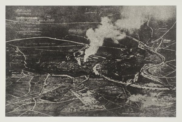
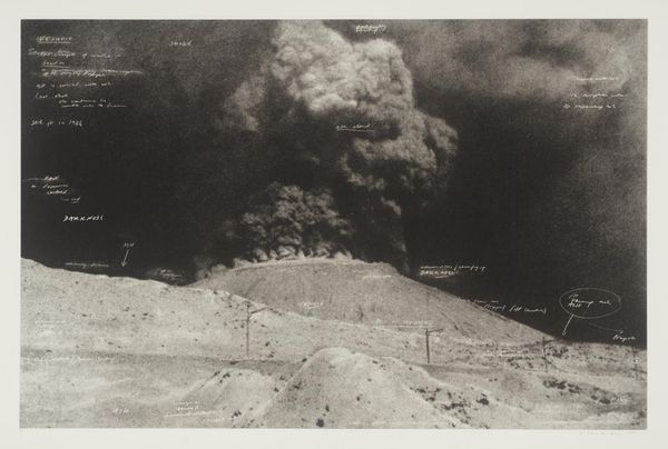
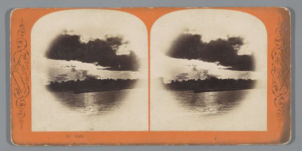
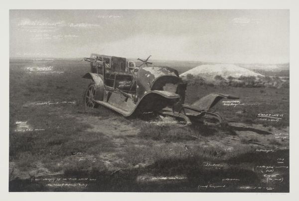
Curator: Tacita Dean’s photogravure, "The Crimea," presents a stark landscape. What is your initial reaction? Editor: There's a haunting quality to it. The monochromatic palette and blurred textures evoke a sense of desolation and loss. Curator: The title references the Crimean War, a conflict marked by immense suffering. Note how Dean overlays text onto the image, almost like spectral echoes. Editor: Yes, the fragmented words add another layer of complexity. The contrast between the sharp text and the indistinct background creates visual tension. It's like a memory struggling to surface. Curator: Precisely. The image becomes a meditation on history, memory, and the enduring impact of conflict on the landscape and collective psyche. Editor: It leaves me pondering the weight of history and how artists interpret events through materiality. Curator: Indeed, a powerful statement about how the past continues to resonate within our present.
Comments
Join the conversation
Join millions of artists and users on Artera today and experience the ultimate creative platform.
tate 11 months ago
⋮
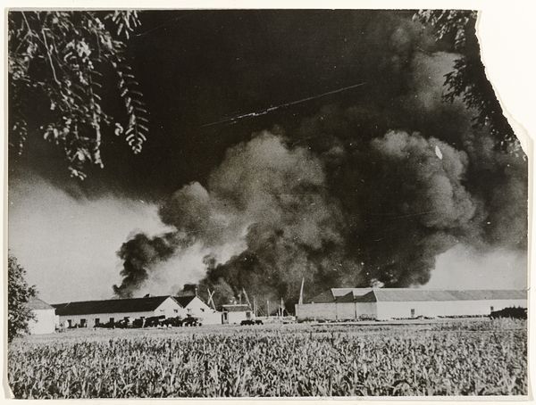
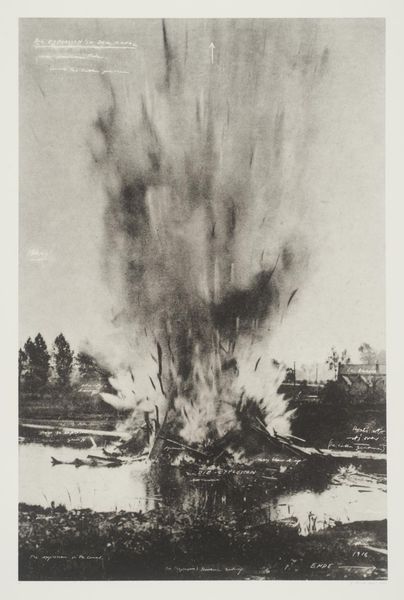
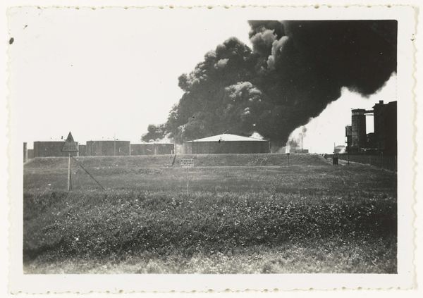
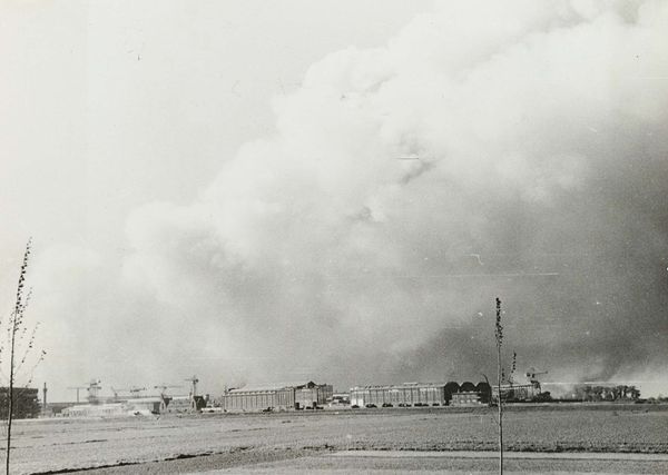
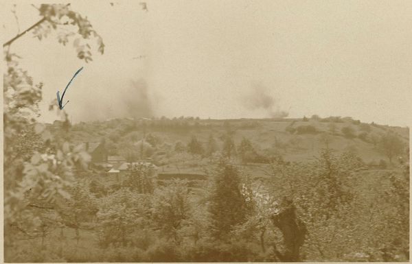
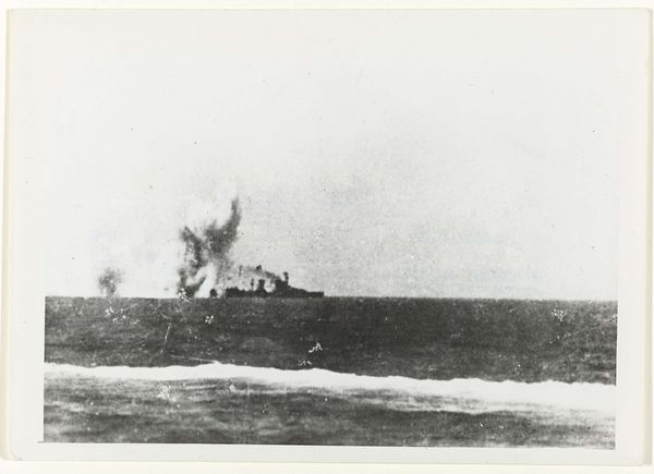
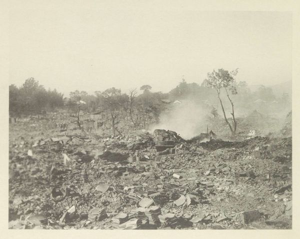
The Crimea belongs to a portfolio of twenty black and white photogravures with etching collectively entitled The Russian Ending. The portfolio was printed by Niels Borch Jensen, Copenhagen and published by Peter Blum Editions, New York in an edition of thirty-five; Tate’s copy is the fifth of ten artist’s proofs. Each image in the portfolio is derived from a postcard collected by the artist in her visits to European flea markets. Most of the images depict accidents and disasters, both man-made and natural. Superimposed on each image are white handwritten notes in the style of film directions with instructions for lighting, sound and camera movements, suggesting that the each picture is the working note for a film. The title of the series is taken from a convention in the early years of the Danish film industry when each film was produced in two versions, one with a happy ending for the American market, the other with a tragic ending for Soviet audiences. Dean’s interventions encourage viewers to formulate narratives leading up to the tragic denouements in the prints, engaging and implicating the audience in the creative process.
More like this