Dimensions: image: 450 x 685 mm support: 540 x 690 mm
Copyright: © Tacita Dean, courtesy Frith Street Gallery, London and Marian Goodman Gallery, New York/Paris | CC-BY-NC-ND 4.0 DEED, Photo: Tate
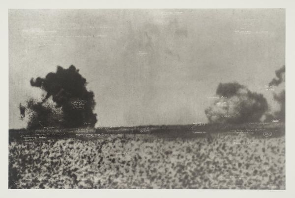
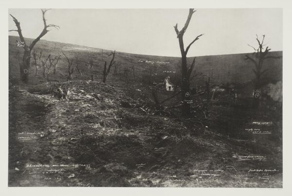
Editor: Tacita Dean's "Der Rückzug nach Verdun" presents a monochromatic aerial view, reminiscent of historical maps or reconnaissance photographs. There's something haunting about it. What do you see in this piece? Curator: I see a critical engagement with the means of production of historical narratives. Dean appropriates the visual language of wartime documentation, but the handwritten annotations disrupt its supposed objectivity. The image becomes less about representing a place, and more about the labor of constructing a specific understanding of war, the materiality of conflict. Editor: So, it's about how the image is made and what it represents? Curator: Precisely. It's a reminder that even seemingly objective images are shaped by human intervention and the specific materials of their creation and consumption. Editor: I see. It definitely gives me a new perspective on how to look at images of conflict. Curator: Indeed, challenging traditional boundaries between art, document, and historical record.
Comments
tate 11 months ago
⋮
http://www.tate.org.uk/art/artworks/dean-der-ruckzug-nach-verdun-p20255
Join the conversation
Join millions of artists and users on Artera today and experience the ultimate creative platform.
tate 11 months ago
⋮
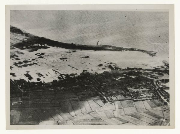
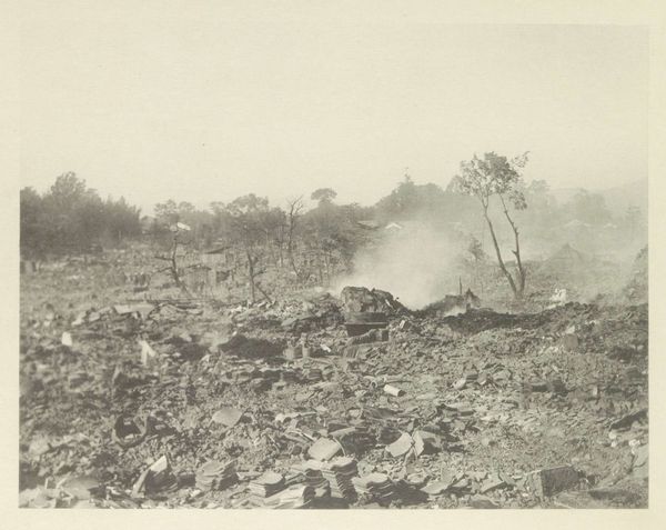
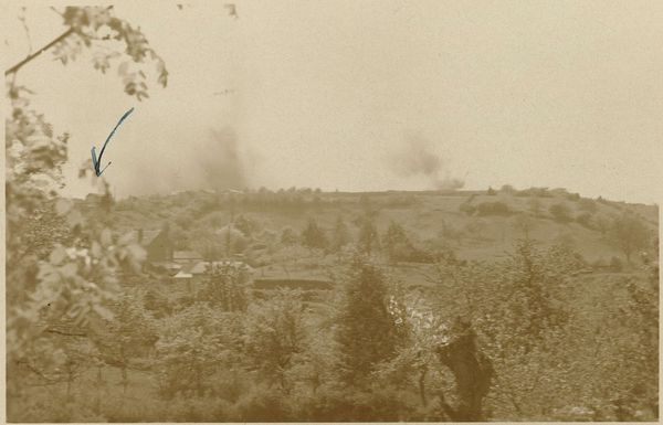
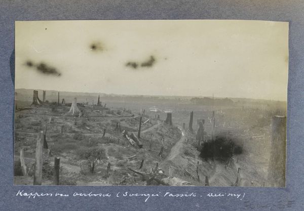
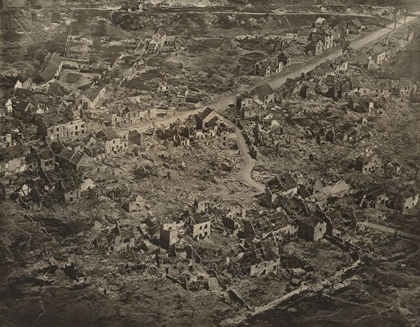
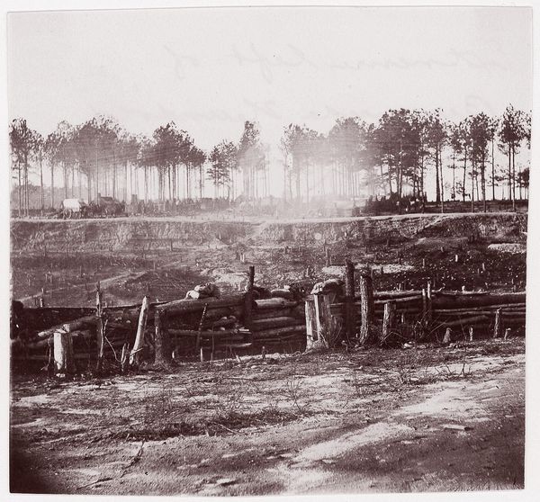
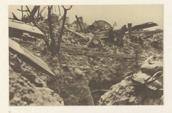
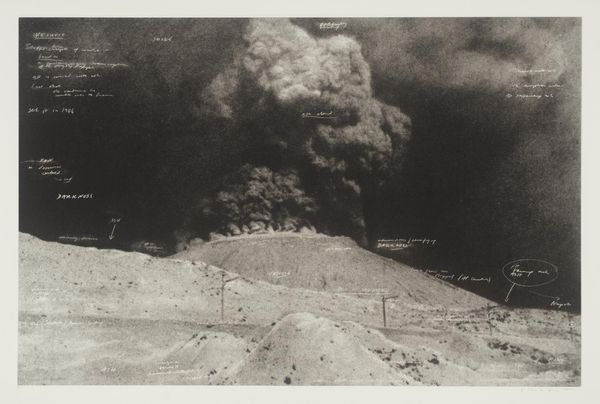
Der Rückzug nach Verdun belongs to a portfolio of twenty black and white photogravures with etching collectively entitled The Russian Ending. The portfolio was printed by Niels Borch Jensen, Copenhagen and published by Peter Blum Editions, New York in an edition of thirty-five; Tate’s copy is the fifth of ten artist’s proofs. Each image in the portfolio is derived from a postcard collected by the artist in her visits to European flea markets. Most of the images depict accidents and disasters, both man-made and natural. Superimposed on each image are white handwritten notes in the style of film directions with instructions for lighting, sound and camera movements, suggesting that the each picture is the working note for a film. The title of the series is taken from a convention in the early years of the Danish film industry when each film was produced in two versions, one with a happy ending for the American market, the other with a tragic ending for Russian audiences. Dean’s interventions encourage viewers to formulate narratives leading up to the tragic denouements in the prints, engaging and implicating the audience in the creative process.
More like this