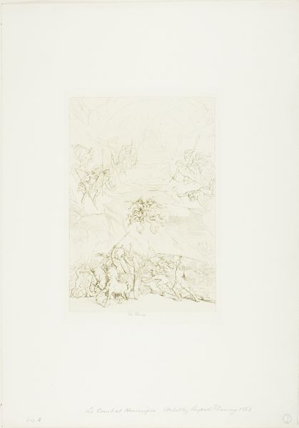
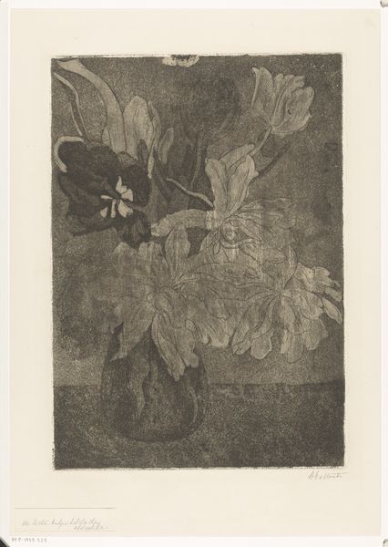
drawing, print, etching, ink
#
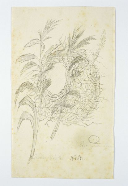
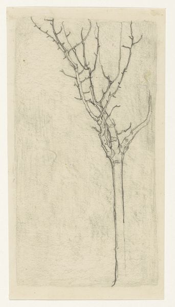
drawing
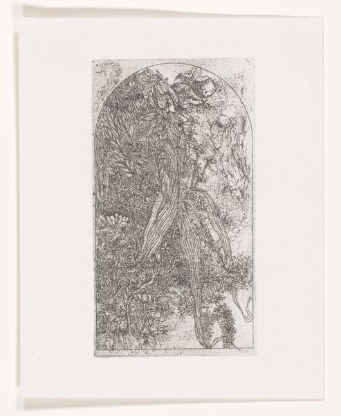
# print
#
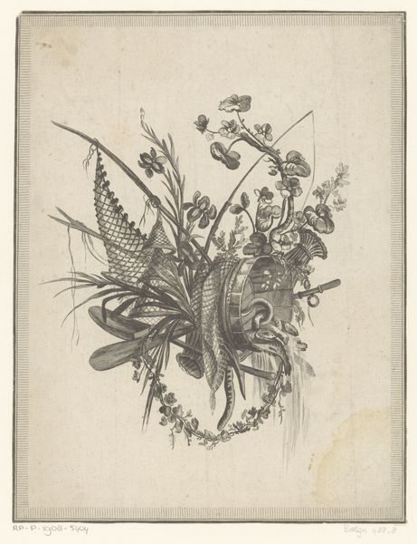
etching
#
etching
#
ink
#
line
Dimensions: height 175 mm, width 89 mm, height 120 mm, width 74 mm
Copyright: Rijks Museum: Open Domain
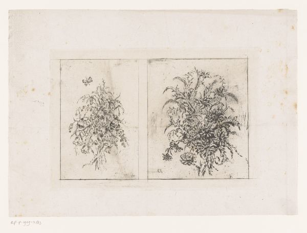
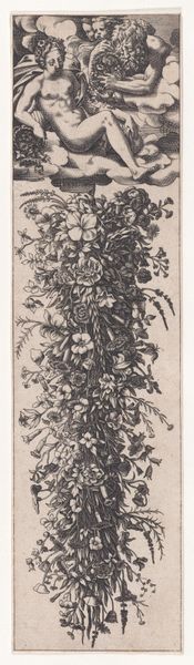
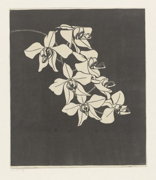
Editor: We're looking at "Bloemen," or "Flowers," by Kees Stoop, likely created sometime between 1944 and 1990. It’s an etching, done with ink, and it gives the piece a very linear quality. The subject matter is pretty straightforward, but something about the stark black and white and the density of the lines makes it feel a bit unsettling. What do you see in this work? Curator: The dynamism lies precisely in the tension between the representational and the abstract, wouldn’t you agree? Observe the rhythmic quality of the lines. Stoop harnesses the graphic potential of the etched line to define not just shape but also texture and depth, without recourse to color. Consider the surface of the print itself—do you notice its inherent materiality contributing to the viewing experience? Editor: I do see the contrast you’re mentioning! But how does focusing solely on these aspects impact the interpretation, considering it’s just flowers? Isn't it, well, just flowers? Curator: To label it "just flowers" is to disregard the deliberate choices made in the application of line, the composition of forms, and the overall tonal values, no? Are those curving or intersecting lines perhaps more evocative than imitative? Think about it as less a window onto a bouquet and more an examination of how an image emerges from marks on a surface. That's where meaning arises for me. Editor: So you're suggesting that it's not really about *what* is depicted, but *how* it is? That helps me see it a different way! Thank you. Curator: Precisely! I'm glad we had this dialogue.
Comments
No comments
Be the first to comment and join the conversation on the ultimate creative platform.
More like this