Dimensions: height 308 mm, width 229 mm
Copyright: Rijks Museum: Open Domain
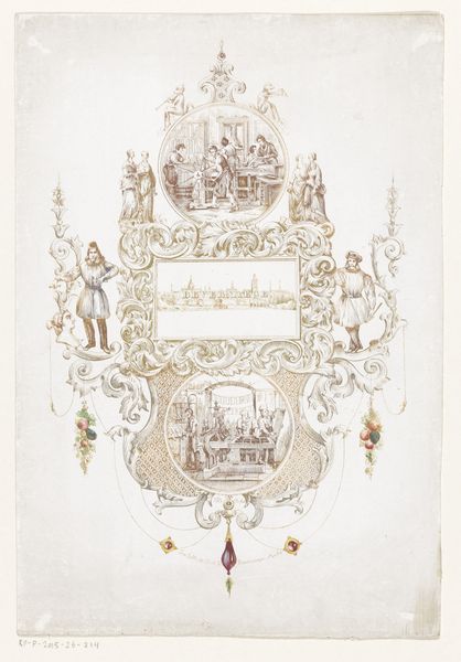
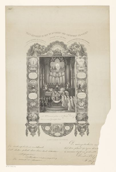
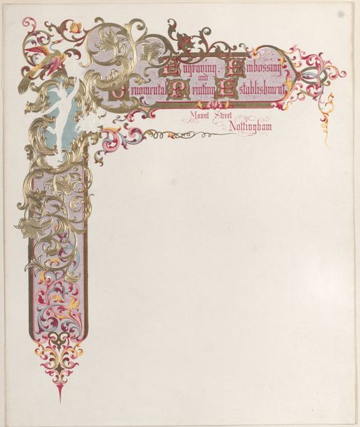
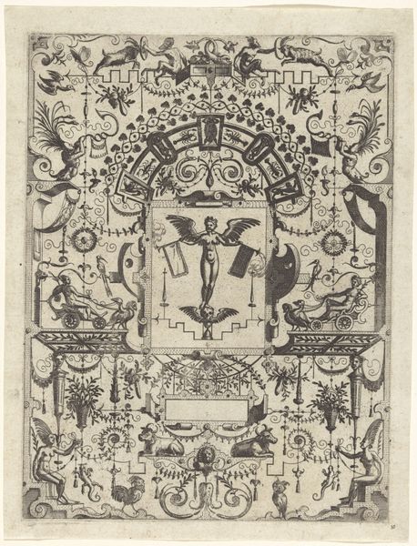
Curator: This intricate lithograph, dating from around 1860 to 1870, served as an advertisement for the Antwerp-based printing house of S. Mayer. What’s your initial take? Editor: Overwhelming! There's so much to visually unpack here. The ornate frame, the cherubs, the cameos... it creates a really strong sense of romantic idealism around the act of printing. Curator: Absolutely. Considering the time, the image operates within a framework where industry and artistry were presented as intertwined virtues, tied to a rising bourgeois class in the Belgian context. We see idealized workers, almost angelic, rendering service to this establishment. It reinforces social hierarchies but attempts to ennoble labor within it. Editor: You see it, of course, right away. I was looking at the framing. Notice the ovals arrayed on both sides with scenes that represent work within the firm. Each of the little framed areas contains activity of some kind. Curator: Precisely. Each carefully arranged tableau reinforces this message, doesn't it? This company isn't just providing a service. It offers a genteel occupation within this historical framework. This image appeals to those commissioning and doing work there as cultured contributors within this matrix. Editor: I can see that, and consider how the cherubs almost hold up or support the work on the periphery of each vignette. I'm drawn, however, to the slightly distressed surface of the main advertisement panel, that textural quality. It feels aged, patinated, in an interesting way that perhaps conveys enduring craft. Curator: True, there’s something about how that sign persists that lends authority. But also observe the composition around that—it’s populated by symbolic figures that assert the labor depicted in the insets around it is being divinely witnessed and appreciated! Editor: And there is a tension between divine, represented by those figures and cherubs, and quotidian reality. Still, as a formal arrangement, all this is cleverly unified by color to emphasize visual balance in design overall. Curator: The convergence of art, commerce, and class is palpable. We glimpse both the idealized narrative and the socio-political context. Editor: Indeed. Deconstructing an image so dense in visual language makes one appreciate both the era and the visual craft employed.
Comments
No comments
Be the first to comment and join the conversation on the ultimate creative platform.
