drawing, paper, ink
#
drawing
#
art-nouveau
#
ink drawing
#
paper
#
ink
#
symbolism
Copyright: Rijks Museum: Open Domain
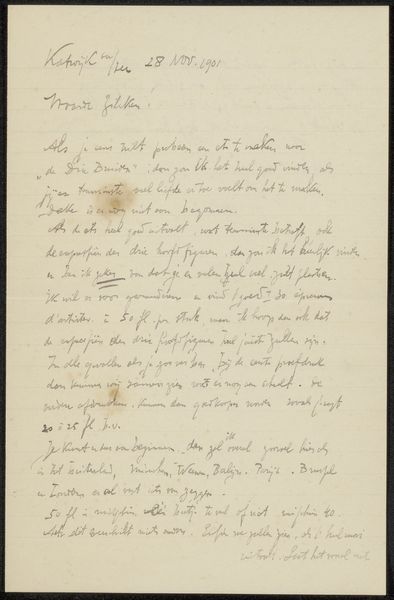
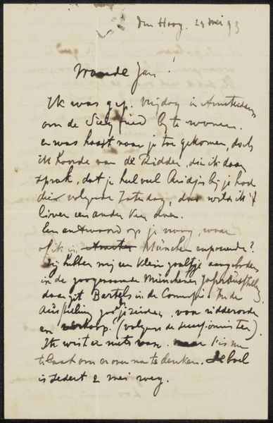
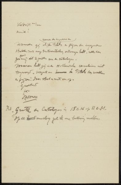
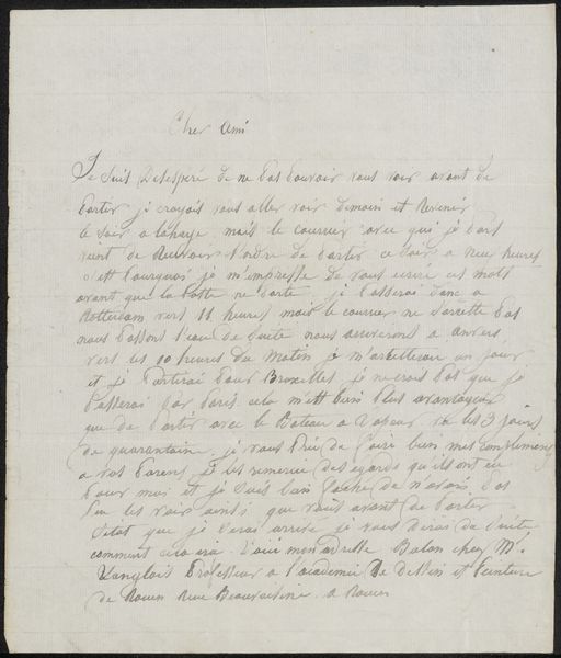
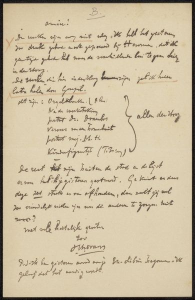
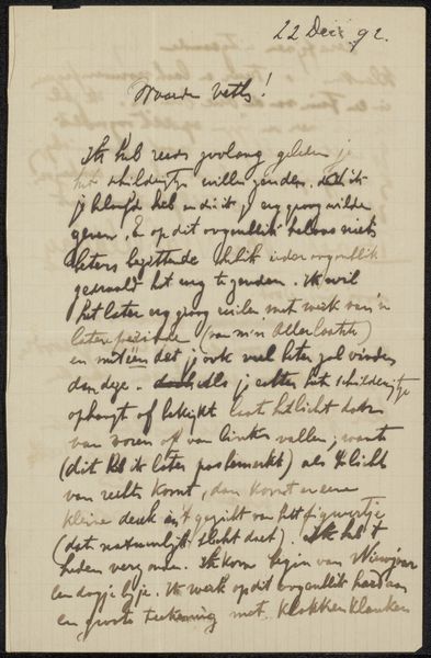
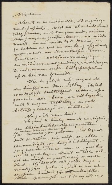
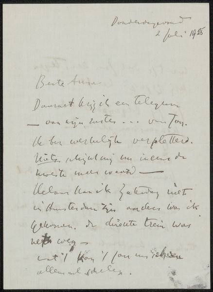
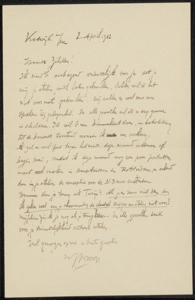
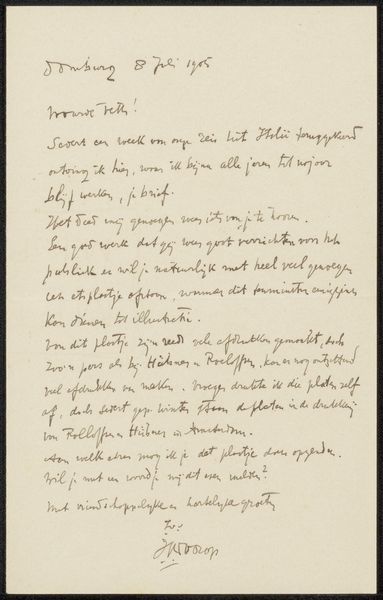
Editor: Here we have "Brief aan Philip Zilcken" by Jan Toorop, likely created between 1868 and 1928, judging by the dates associated with it. It’s an ink drawing on paper. I am really taken by the artist's hand writing – the fluid lines forming each letter look both spontaneous and carefully constructed. How do you interpret this work? Curator: The first aspect that draws my attention is the arrangement of text. Notice the artist's particular treatment of form and composition in laying out their written thought – what decisions might have led the artist to choose the amount of leading between lines, and what overall effects are created in doing so? Editor: That’s an interesting point. I was so focused on the pure aesthetic of the marks themselves that I missed how much space there is above, below, and around the text, in an otherwise dense formation of writing in the page’s center. Curator: Precisely. It is also valuable to observe how Toorop varies the thickness of the ink as well as letter height to draw emphasis to certain words; furthermore, Toorop adopts an intricate signature and postscript – note the embellishments given to his stylized "J" in comparison to its simpler deployment in the bulk text. What meaning might be conveyed through the artist's hand via these techniques? Editor: That’s a perspective I had not considered; it certainly shifts the focus from mere communication to artistic expression using the act of writing itself. The stylistic choices clearly add a layer of visual complexity. I've gained a completely new outlook on Toorop’s intentions here, analyzing his choice of marks. Curator: Indeed, it reveals the artist's formal engagement in every part of their artwork’s construction, and the unique considerations found when writing meets drawing.
Comments
No comments
Be the first to comment and join the conversation on the ultimate creative platform.
More like this