drawing, paper, ink, pen
#
drawing
#
hand-lettering
#
ink paper printed
#
hand drawn type
#
paper
#
personal sketchbook
#
ink
#
hand-drawn typeface
#
ink drawing experimentation
#
intimism
#
pen-ink sketch
#
pen work
#
sketchbook drawing
#
pen
#
sketchbook art
#
calligraphy
Copyright: Rijks Museum: Open Domain
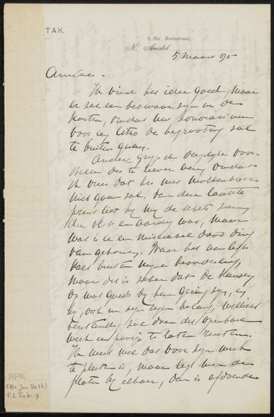
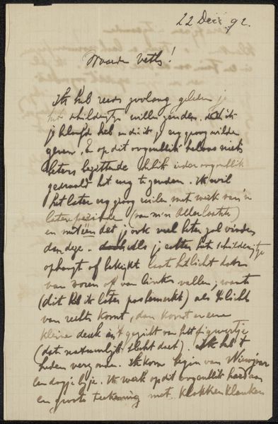
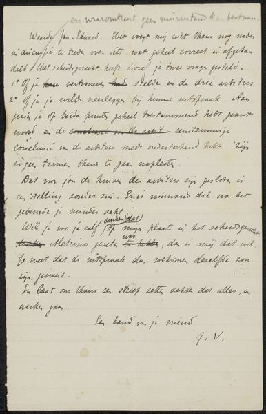
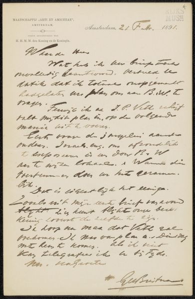
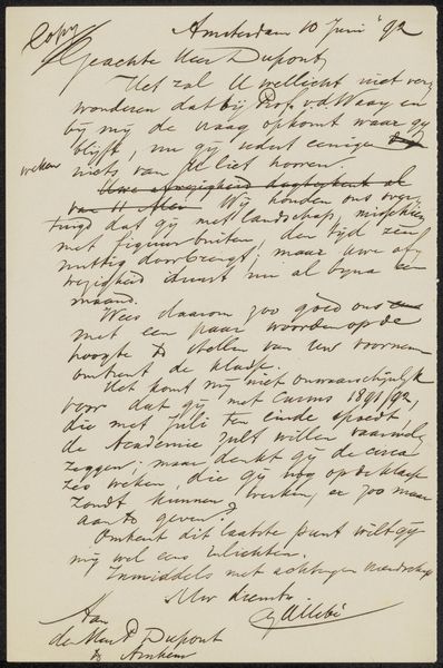
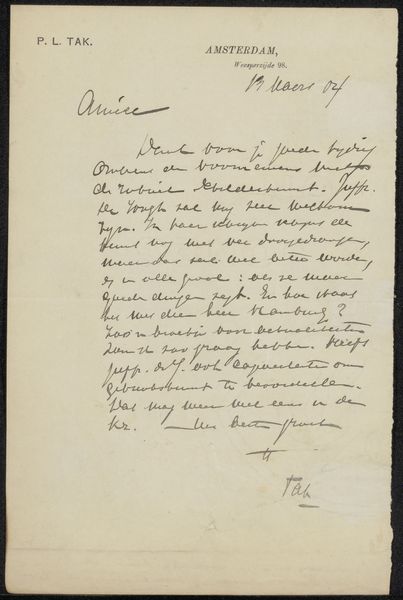
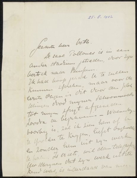
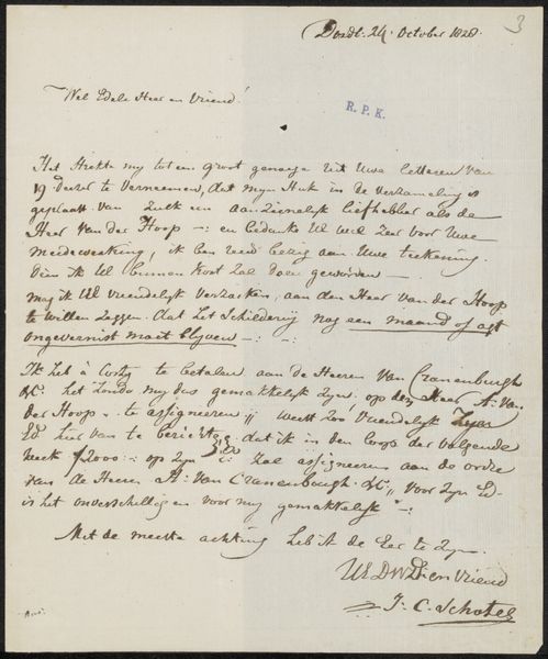
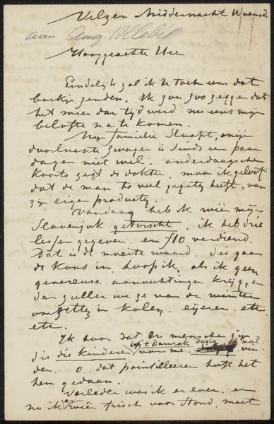
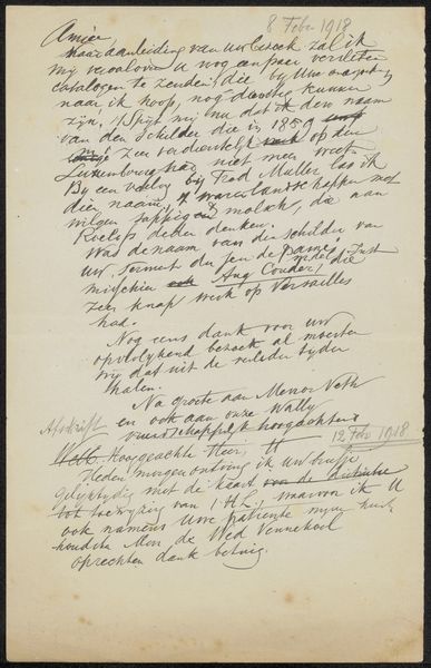
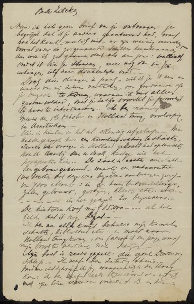
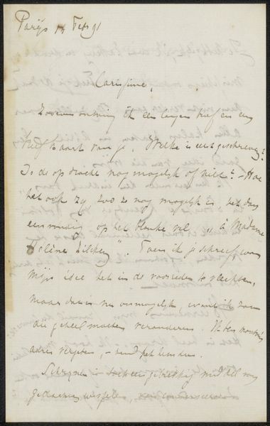
Curator: We're now looking at a letter, more specifically, an ink drawing on paper, titled "Brief aan Jan Veth", potentially dating between 1901 and 1928, created by Pieter Lodewijk Tak. It showcases some very expressive, hand-drawn lettering. Editor: Wow, the immediate feeling I get is one of intimacy and personal reflection. It's a raw glimpse into someone's thoughts, captured in fluid, almost dancing script. There’s something vulnerable about handwritten letters, you know? Especially ones that feel this spontaneous. Curator: Yes, I think "intimacy" is a key element here. The handwritten nature lends a sense of closeness. Note the deliberate, almost calligraphic, quality mixed with the casual sketch-like quality. There’s an experimentation with form that reflects a freedom of expression we might associate with personal sketchbooks. Editor: Absolutely! It’s like catching the artist in a moment of pure creation, completely unfiltered. I love how the lines vary in thickness and darkness, creating a visual rhythm that draws you in. There are shapes suggesting doodles among the script, making you want to piece everything together to catch a glimmer of their mind, almost like reading tea leaves. It makes it so human. Curator: And I believe that relates to the overall theme. Given its nature, this wasn't necessarily meant to be a formal piece of art, but a heartfelt message to Jan Veth, most probably, exploring the relationship with its recipient. So the symbolism rests in its informality and immediacy. The raw pen strokes, the imperfections - they communicate authenticity and sincere sentiment. Editor: It really does. Looking at it, I feel a desire to pen something similar. To catch a moment, an experience or fleeting thought in the form of script with such honest feeling, and I imagine people could view a simple letter with so much feeling put into it. There's a unique art in it that deserves so much more than just what words could communicate, if that makes sense. Curator: It makes perfect sense. It's that idea that art isn't always grand or imposing, it can exist in these very personal, often overlooked, forms. It can be a portal into someone’s soul. Editor: Exactly! A beautiful little reminder that sometimes the most powerful expressions are the ones scribbled on a piece of paper. A bit lovely if I'm honest.
Comments
No comments
Be the first to comment and join the conversation on the ultimate creative platform.
More like this