About this artwork
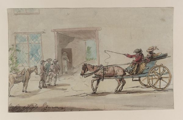
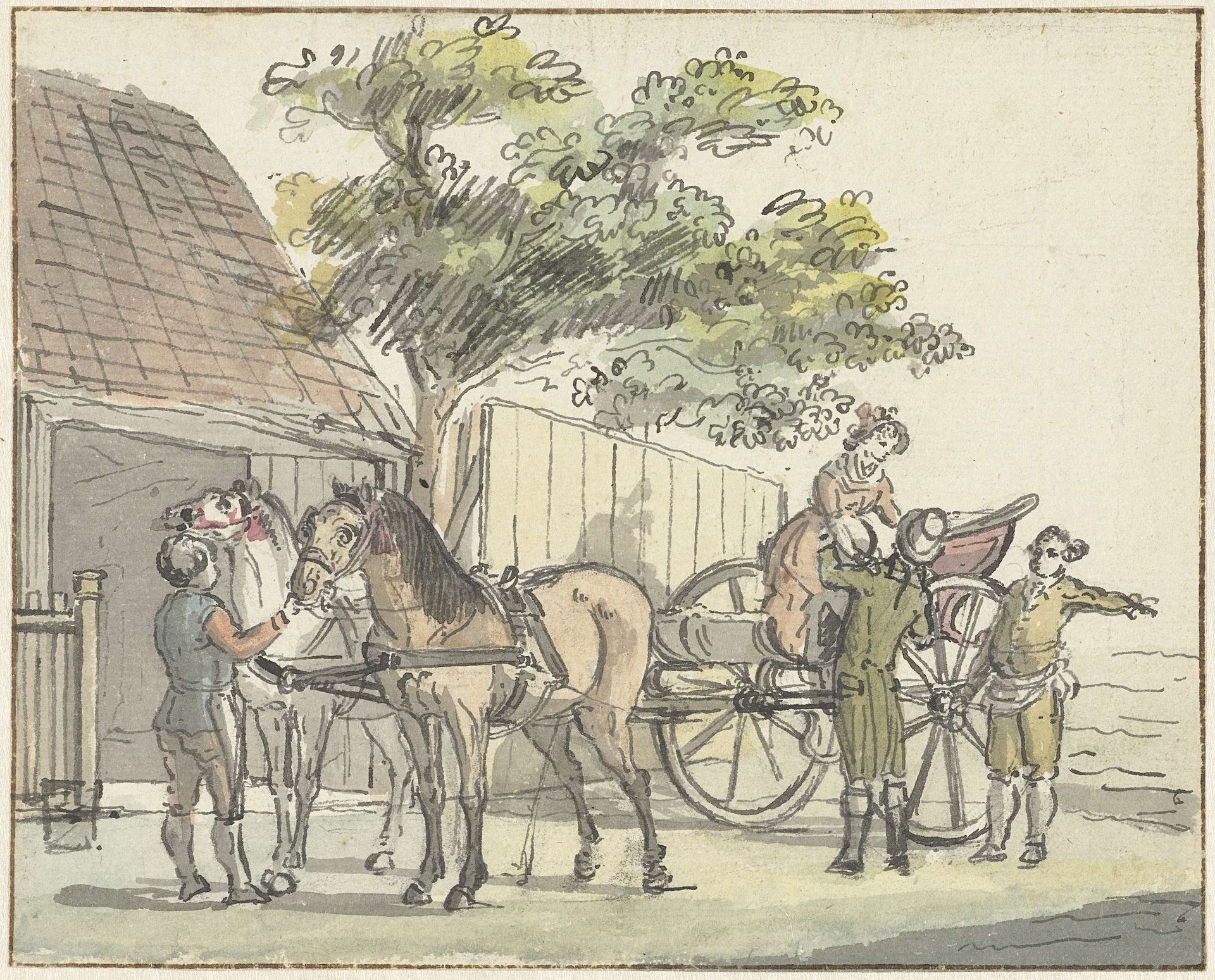
Editor: Here we have Reinier Vinkeles's "Wagen met twee paarden bij de uitspanning De Donkere Kuil bij Haarlem," likely from 1815. It’s a pen, ink and watercolour drawing currently held at the Rijksmuseum. There’s a charming, almost naive quality to the rendering, especially in the figures and horses. How would you interpret this work, focusing on its compositional elements? Curator: Certainly. Notice first the relatively simple composition: a dominant horizontal axis reinforced by the wagon and the building's structure, against which the organic verticality of the tree offers a visual counterpoint. The subtle washes of color, primarily muted greens and browns, create depth but do not distract from the linearity of the drawing. What effect do you think this combination achieves? Editor: I guess the muted colours make it feel more like a sketch? It doesn’t feel overworked. It keeps that sketchbook quality. Curator: Precisely. The unfinished quality emphasizes the immediacy of the artist's observation. Consider the structural interplay between line and wash: how the crisp ink defines forms, while the watercolour adds atmospheric perspective, softening edges and creating spatial recession. Editor: I see that now! The building is sharper, more clearly defined and angular. While the horses seem like their edges bleed into the scene through the watercolour. That’s a great touch to bring attention to the foreground, where the real action happens! I never would have noticed that. Curator: Yes, notice too the rhythmic distribution of figures—each occupies a distinct spatial plane, creating a measured sense of movement across the composition. Ultimately, it's through this rigorous interplay of elements that Vinkeles constructs a compelling visual experience. Editor: I hadn't considered the positioning of figures so carefully! Thank you for highlighting the structure of the illustration.
Wagen met twee paarden bij de uitspanning De Donkere Kuil bij Haarlem
Possibly 1815
Reinier Vinkeles
1741 - 1816Location
RijksmuseumArtwork details
- Medium
- drawing, plein-air, watercolor
- Dimensions
- height 130 mm, width 163 mm
- Location
- Rijksmuseum
- Copyright
- Rijks Museum: Open Domain
Tags
Comments
Share your thoughts
About this artwork
Editor: Here we have Reinier Vinkeles's "Wagen met twee paarden bij de uitspanning De Donkere Kuil bij Haarlem," likely from 1815. It’s a pen, ink and watercolour drawing currently held at the Rijksmuseum. There’s a charming, almost naive quality to the rendering, especially in the figures and horses. How would you interpret this work, focusing on its compositional elements? Curator: Certainly. Notice first the relatively simple composition: a dominant horizontal axis reinforced by the wagon and the building's structure, against which the organic verticality of the tree offers a visual counterpoint. The subtle washes of color, primarily muted greens and browns, create depth but do not distract from the linearity of the drawing. What effect do you think this combination achieves? Editor: I guess the muted colours make it feel more like a sketch? It doesn’t feel overworked. It keeps that sketchbook quality. Curator: Precisely. The unfinished quality emphasizes the immediacy of the artist's observation. Consider the structural interplay between line and wash: how the crisp ink defines forms, while the watercolour adds atmospheric perspective, softening edges and creating spatial recession. Editor: I see that now! The building is sharper, more clearly defined and angular. While the horses seem like their edges bleed into the scene through the watercolour. That’s a great touch to bring attention to the foreground, where the real action happens! I never would have noticed that. Curator: Yes, notice too the rhythmic distribution of figures—each occupies a distinct spatial plane, creating a measured sense of movement across the composition. Ultimately, it's through this rigorous interplay of elements that Vinkeles constructs a compelling visual experience. Editor: I hadn't considered the positioning of figures so carefully! Thank you for highlighting the structure of the illustration.
Comments
Share your thoughts
