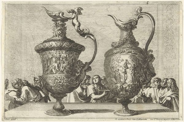
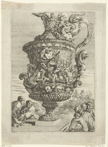
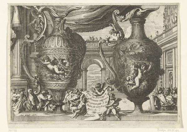
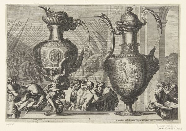
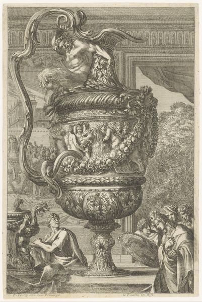
print, engraving
allegory
baroque
form
line
engraving
Dimensions: height 152 mm, width 220 mm
Copyright: Rijks Museum: Open Domain
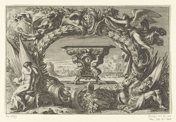
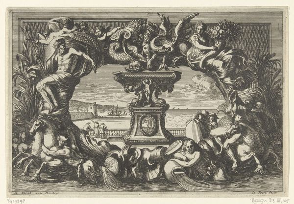
Editor: Here we have “Two ewers facing left," an engraving by Jean Lepautre, dating from 1669 to 1693. It's incredibly ornate! All these embellishments make it hard to parse, visually. What can you tell me about its composition? Curator: Notice first the absolute symmetry, disrupted only by minute variations in the pitchers. These variations offer visual interest. Consider, too, the complex layering of the ornament: figures at the base mirroring the ones at the top. What does that symmetry suggest to you? Editor: Harmony? Balance? There's also a flatness...the figures seem pressed onto the background, like appliqués. Curator: Precisely! Observe the tension created by this denial of depth against the otherwise florid ornamentation, that very Baroque characteristic of the period, might we say? Editor: The use of line is so detailed, almost overwhelming! It really flattens the depth and the perspective here. Is this a typical function of line engraving from this period? Curator: Line engraving often prioritizes clarity and detail. Look closely, and note how Lepautre uses varied line weights to suggest form, however minimally. Do you see the heavier lines defining the edges of objects, while finer lines create texture and shadow? Editor: Yes, now that you mention it, I notice. It seems like he’s working with a tension between flatness and depth in miniature right here. Curator: Precisely. We could consider then that the artist's decision here offers an aesthetic rather than a realistic representation. This manipulation serves a very real artistic intent. Editor: So, in appreciating its Baroque style through an understanding of form and composition, we see Lepautre playing with contrasts. Thanks for pointing out this dialogue! Curator: A valuable practice in visual literacy. My pleasure.
Comments
No comments
Be the first to comment and join the conversation on the ultimate creative platform.