Dimensions: height 42 mm, width 71 mm
Copyright: Rijks Museum: Open Domain
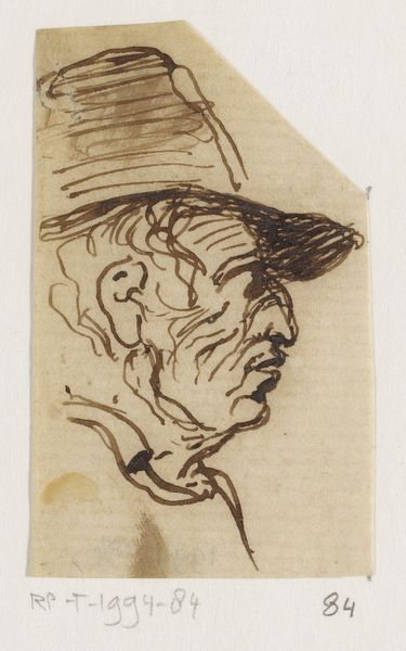
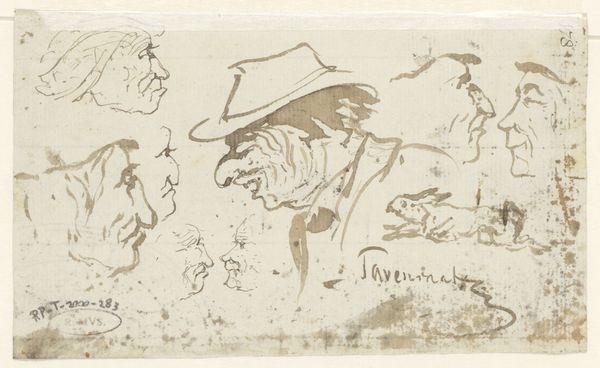
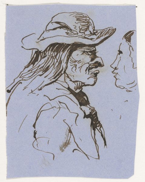
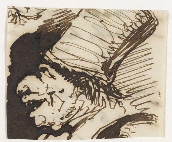
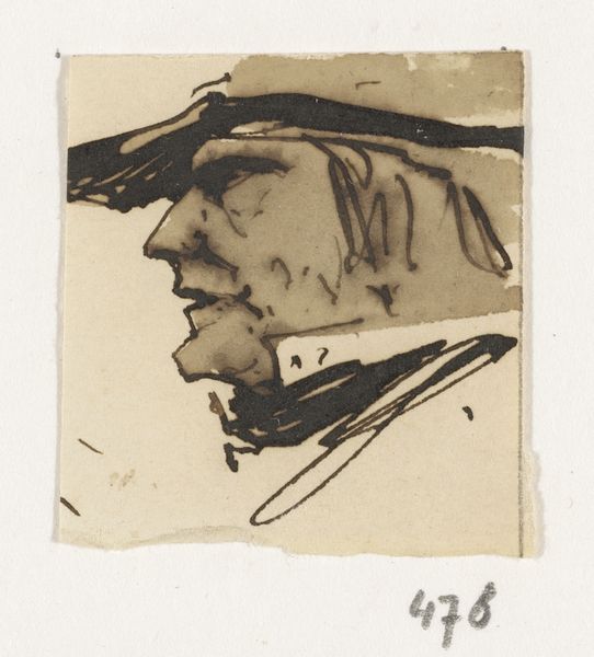
Editor: So, here we have "Kop" – Head, I suppose - by Johannes Tavenraat, dating from around 1840 to 1880. It's an ink drawing, and I'm immediately struck by how rough and unfinished it appears. There's a raw energy to the lines. What stands out to you about its construction? Curator: Indeed, the apparent incompleteness offers an intriguing point of entry. Note the strategic deployment of line; Tavenraat employs varied thicknesses to articulate form and shadow. The concentration of dense linework defines the figure's facial features and the fall of the draped hat. Consider, too, the negative space: is its active presence a calculated formal element? Editor: Yes, I see how the varying line weights create depth, even without shading. Do you think the open areas were intentionally left blank, or was it simply abandoned? Curator: Intention is a precarious notion, but we might consider the formal implications either way. Observe the convergence of lines creating the hat, focusing our attention on the sitter. This invites inquiry into the relation of line to form. Would the addition of further line work augment the piece, or merely obscure its essential construction? Editor: That's a helpful way to think about it – whether more detail would actually add anything or just clutter the image. The unfinished quality does draw you in. I was so focused on the 'lack' of detail. Curator: Precisely. The dialectic between presence and absence can be the very subject of the work, a vital aesthetic principle in Tavenraat's technique. It also challenges preconceived ideas of "completion" in art. Editor: Thanks, that's given me a lot to consider in terms of how we define a 'finished' piece of art and how those choices affect the overall impact.
Comments
No comments
Be the first to comment and join the conversation on the ultimate creative platform.
More like this