#
vegetal
#
pop art-esque
#
enamel pin design
#
childish illustration
#
mother nature
#
egg art
#
pop art
#
bright colours popping
#
pop-art
#
psychedelic
#
nature closeup
Copyright: Modern Artists: Artvee
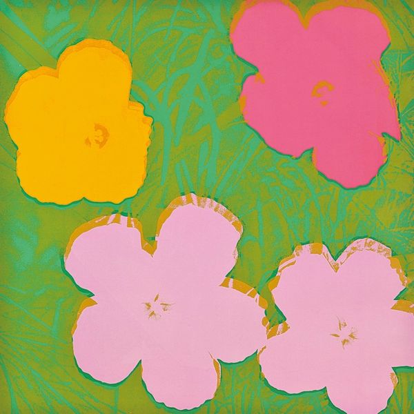
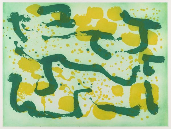
Andy Warhol made this print, Flowers #10, sometime between the 60s and 80s, probably using screenprinting. The bright yellows and greens really pop, don't they? It's like he's saying, "Hey, art can be fun and bold, too!" The way Warhol layers the colors, you can almost feel the texture of the print. It’s not about hiding the process; it's about flaunting it. Take a look at the flower in the lower left, how the yellow kind of bleeds into the green background. I think this feels almost like a dare—a challenge to rethink what art can be. He reminds me a bit of someone like Corita Kent, another artist who wasn't afraid to use bright colors and simple shapes to make a statement. Both of them really push the boundaries of what we think of as 'high art', inviting us to find beauty in the everyday.
Comments
No comments
Be the first to comment and join the conversation on the ultimate creative platform.
More like this