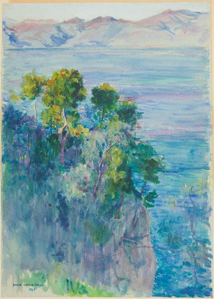
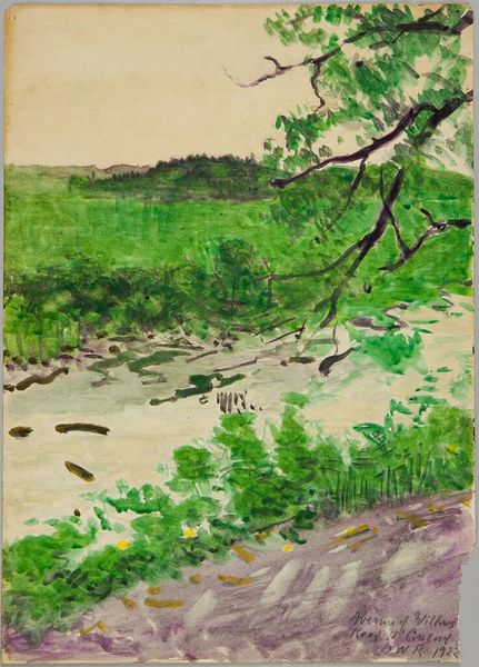
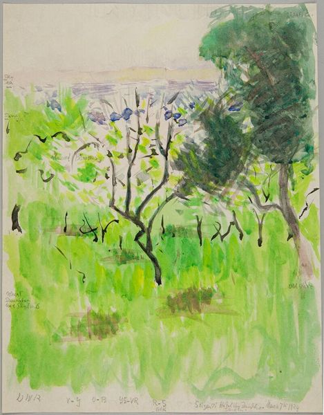
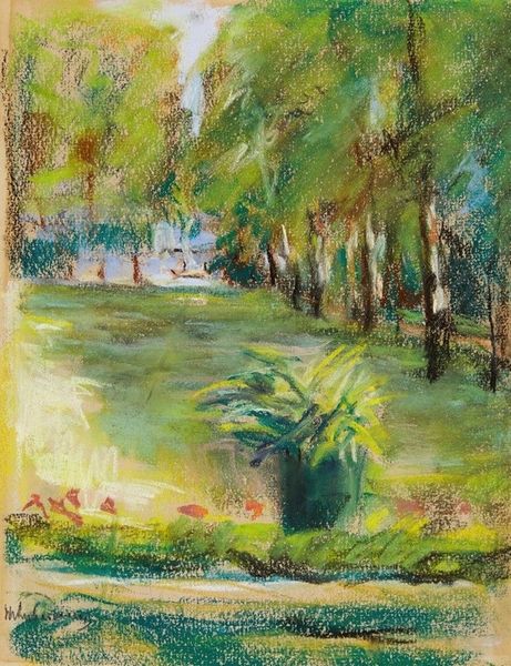
Copyright: David Burliuk,Fair Use
David Burliuk made this Long Island landscape with what looks like watercolor and crayon in 1949. It's a dreamy scene, where the process feels as important as the place. Burliuk’s pastel palette is like a summer haze, where soft greens, blues, and yellows meet and bleed into one another. It's all about the texture here. You can see the grain of the paper coming through in the sky, which makes you feel like you could reach out and touch it. Then, there are these intense scribbles of green and yellow in the lower left, forming a bush. It’s these very gestural moments that makes the painting feel so alive. This approach has echoes of Impressionism, like maybe Monet's softer landscapes, but with a raw, personal touch. Burliuk reminds us that art is always a conversation, a blend of observation, emotion, and the sheer joy of putting colors on paper.
Comments
No comments
Be the first to comment and join the conversation on the ultimate creative platform.