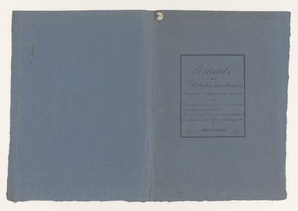
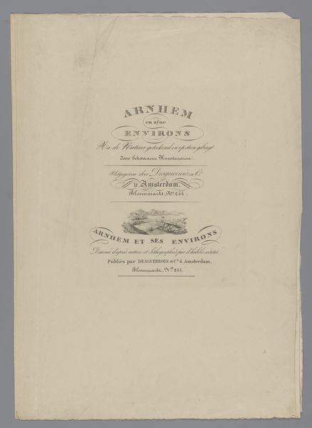
Omslag voor etudes d'après nature a l'usage des elèves 1824 - 1825
bartholomeusjohannesvanhove
Rijksmuseum
drawing, print, paper
drawing
aged paper
homemade paper
paper non-digital material
paperlike
light coloured
landscape
paper
fading type
romanticism
stylized text
thick font
design on paper
historical font
Dimensions: height 285 mm, width 220 mm, height 285 mm, width 440 mm
Copyright: Rijks Museum: Open Domain
Curator: Here we have an intriguing print titled "Omslag voor etudes d'après nature à l'usage des élèves," which translates roughly to "Cover for nature studies for the use of students," created around 1824-1825 by Bartholomeus Johannes van Hove. Editor: My initial impression is one of faded elegance. The pale blue paper, the graceful lettering… it whispers of a bygone era of meticulous craftsmanship and pedagogical intent. It's strikingly minimal, isn't it? Curator: Indeed. Van Hove's focus is clearly on legibility and hierarchy. Notice the arrangement of text; the eye is guided downwards, starting with the calligraphic script at the very top and the words "ETUDES" using thick fonts. Editor: I see how the layout enhances the work's instructional purpose. This wasn’t simply about aesthetics; it was about creating a recognizable brand, associating quality studies with B. I van Hove. We see how the emerging field of lithography impacted education! Curator: Precisely. The typeface itself communicates authority and a classical aesthetic. It suggests that these studies are rooted in established artistic principles. Van Hove’s goal here isn't artistic innovation in the purest sense but rather effective communication through graphic design. We also see how the romantic landscape impacted fonts as a sign of quality, luxury, and artistic heritage. Editor: So it becomes interesting in understanding the social conventions surrounding education and artistic training in that era. The "Nature" font appears to float like branches and flora, perhaps implying that this practice of lettering has a pedigree with nature. It underscores the broader Romantic movement's fascination with nature as a source of both inspiration and knowledge. What an eloquent little paper object! Curator: An eloquently argued position. Analyzing this print through the lens of semiotics allows us to unlock deeper meanings. Editor: And considering its function within the historical context enriches our understanding of both the artwork and the era that created it. Curator: Absolutely. The synergy between form and context makes this, in my estimation, a truly intriguing work.
Comments
No comments
Be the first to comment and join the conversation on the ultimate creative platform.