drawing, print, engraving
#
drawing
#
baroque
# print
#
old engraving style
#
geometric
#
engraving
Dimensions: height 210 mm, width 146 mm
Copyright: Rijks Museum: Open Domain
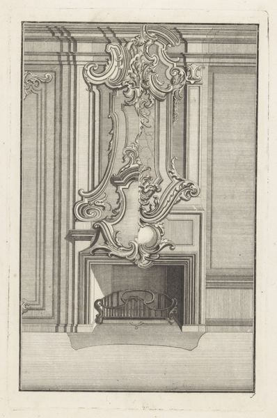
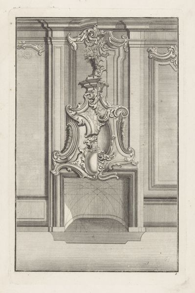
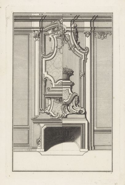
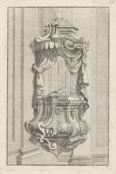
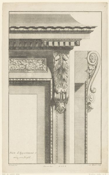
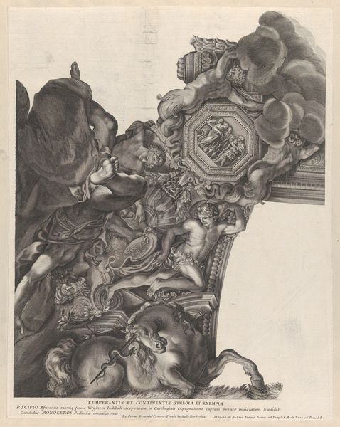
Editor: So, here we have an engraving titled "Hoekconsole," created sometime between 1699 and 1726 by an anonymous artist. It’s currently housed in the Rijksmuseum. It's remarkably detailed. How do you read the visual structure of this piece? Curator: Indeed, let us observe the organization. Notice how the eye is immediately drawn to the elaborate scrollwork, then moves along the shadows to define form and space? The lines are not merely descriptive; they are architectonic. Consider how the engraver employs a clear hierarchy in mark-making. Editor: Architectonic in what way? Curator: The engraving uses precise, deliberate lines. Look at the differing densities and orientations used to denote light, volume and texture; the density and direction shift as perspective dictates. Observe how cross-hatching establishes the shadowed portions while delicately thin strokes articulate highlights. In your view, how do those patterns guide perception? Editor: Well, I can appreciate the skill in using line to convey depth, especially on something so flat. And how the eye constantly shifts perspective between elements. Is that lack of stable perspective intentional, do you think? Curator: It presents a calculated disjunction. By subtly disrupting consistent perspective, the artist amplifies awareness of its constructed nature. It prompts contemplation regarding the very mechanics of representation itself. There is order through suggested discord. Editor: That’s fascinating. It’s a very deliberate effect then, a kind of…visual puzzle almost. I'll never look at Baroque ornamentation the same way. Curator: Precisely. Semiotics through structure are keys to unlocking its purpose, beyond ornamentation.
Comments
No comments
Be the first to comment and join the conversation on the ultimate creative platform.
More like this