Copyright: Rijks Museum: Open Domain
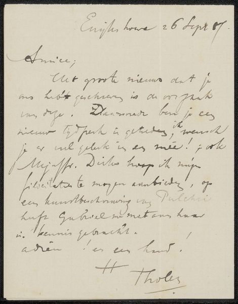
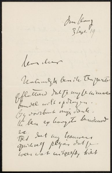
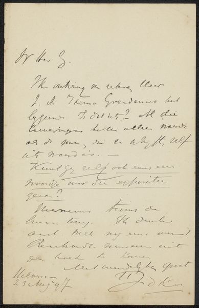
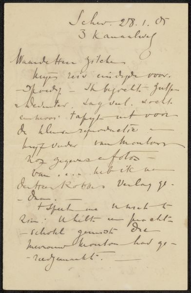
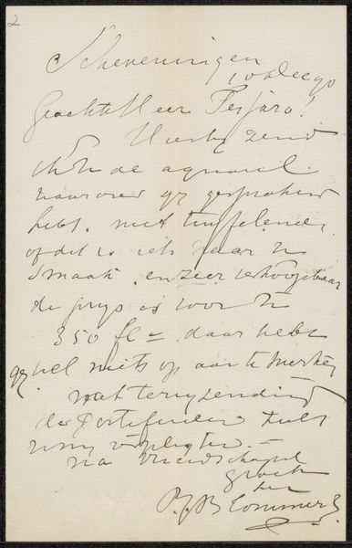
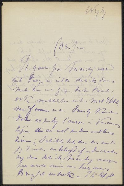
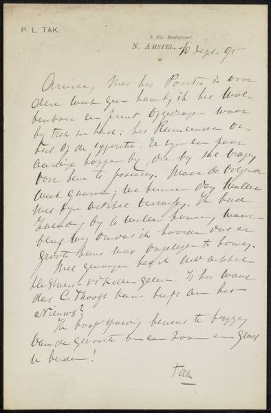
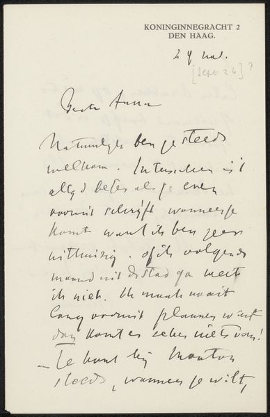
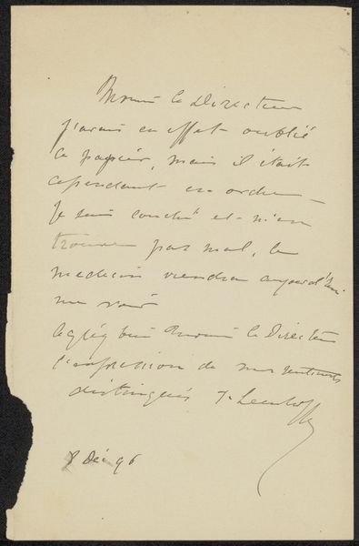
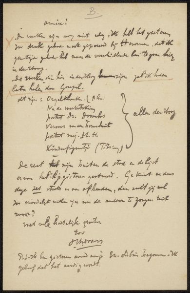
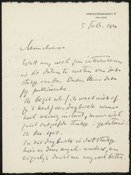
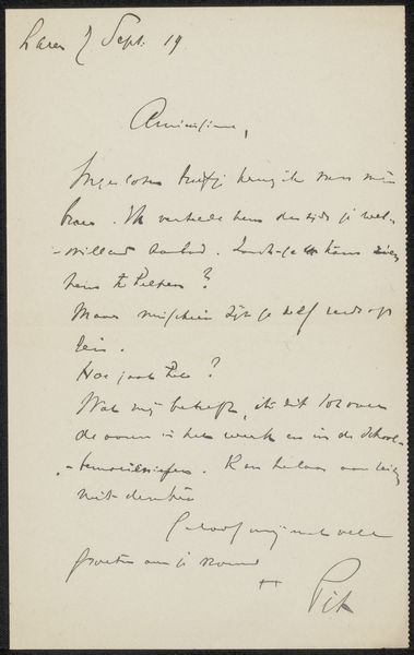
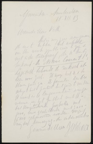
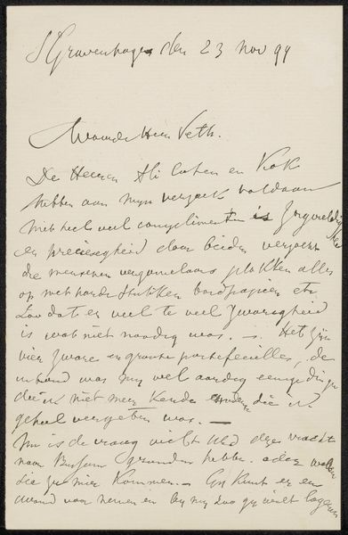
This is a letter, "Brief aan Anna Dorothea Dirks", penned by Isaac Israels. Look at the way the ink flows, how each word seems to dance across the page! It’s like watching a calligrapher in motion, each stroke deliberate yet somehow spontaneous. The colour is muted, faded ink on aged paper. The texture? Smooth where the ink sits, rough where the fibers of the paper resist. The loops and swirls, thick in some places, thin in others, reveal the pressure of Israels' hand. Notice the way the lines sometimes overlap. It reminds me of how we layer paint, building up meaning through a series of gestures. That one looping flourish on the first line? It's a little exuberant, a burst of energy that hints at the artist's personality, or maybe just his mood that day. This letter reminds me of Cy Twombly’s work. In art, as in life, it’s often the imperfections, the irregularities, that make things interesting.
Comments
No comments
Be the first to comment and join the conversation on the ultimate creative platform.
