drawing, paper, pen
#
drawing
#
paper
#
pen
Copyright: Rijks Museum: Open Domain
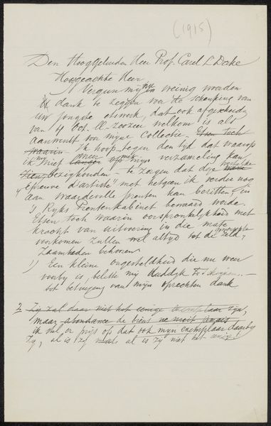
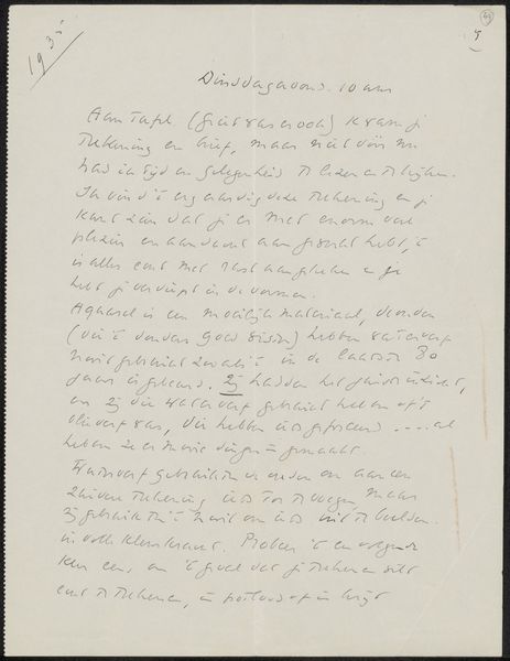
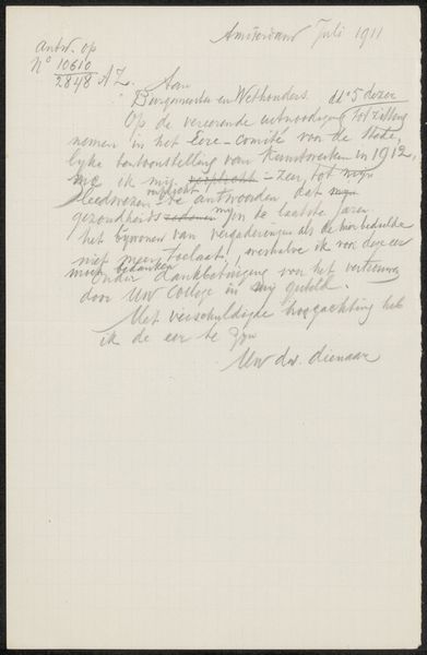
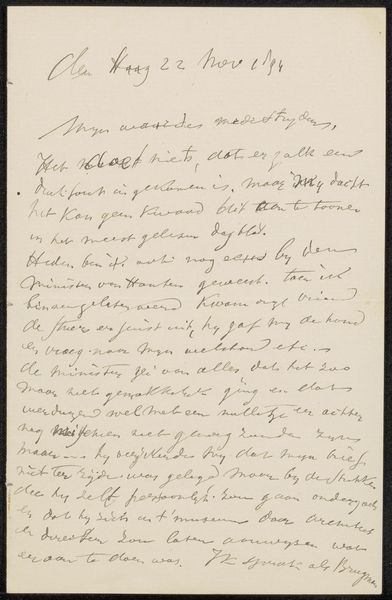
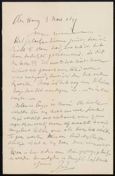
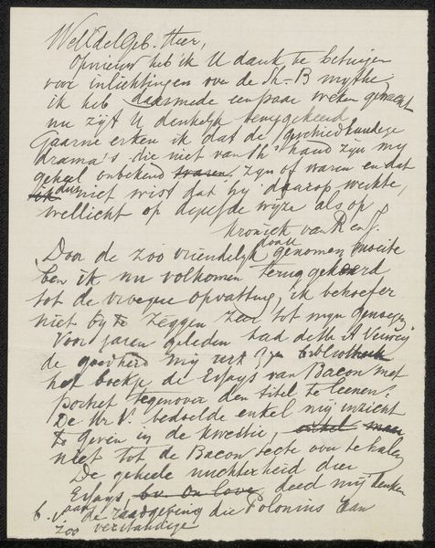
Curator: This drawing, titled "Brief aan Jan Veth," possibly from 1913, created with pen on paper by jonkheer Jacob Hendrik Schorer... its form intrigues me. Editor: It appears to be a handwritten letter. The gray ink on the off-white paper gives it a delicate, almost ethereal quality. The script is difficult to decipher, though. What structural elements define this as art, beyond its textual content? Curator: Precisely. Let’s focus on the formal arrangement. Observe how the lines of text create a textured surface, dense in the upper portion, becoming sparser towards the bottom. Note the calligraphic quality of the handwriting. See the ascenders and descenders of the letters, contributing to a rhythm, almost a visual music, if you will. What is the negative space doing here? Editor: It seems to create a visual hierarchy, doesn’t it? The address at the top is bolder, set apart, almost like a title. And then the signature, at the end... larger, a final flourish balancing the opening. So, the letter's content becomes secondary to its visual structure? Curator: Exactly! The very act of inscription transforms language into image, script into form. It's about appreciating the beauty and expressive potential inherent in the visual organization itself. Do you find this shifts your perspective? Editor: Absolutely. I usually look for narrative content first. Seeing it through a formalist lens makes me appreciate the craftsmanship and compositional decisions. Thanks. Curator: Indeed, the visual rhetoric becomes dominant, prompting new perspectives.
Comments
No comments
Be the first to comment and join the conversation on the ultimate creative platform.
More like this