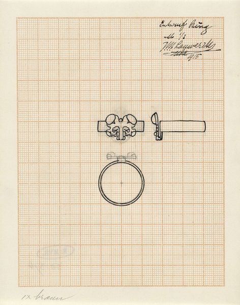
drawing, paper, ink
#
drawing
#
art-nouveau
#
paper
#
ink
#
geometric
#
decorative-art
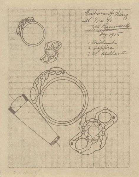
Dimensions: height 150 mm, width 118 mm
Copyright: Rijks Museum: Open Domain
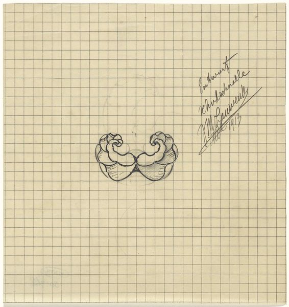
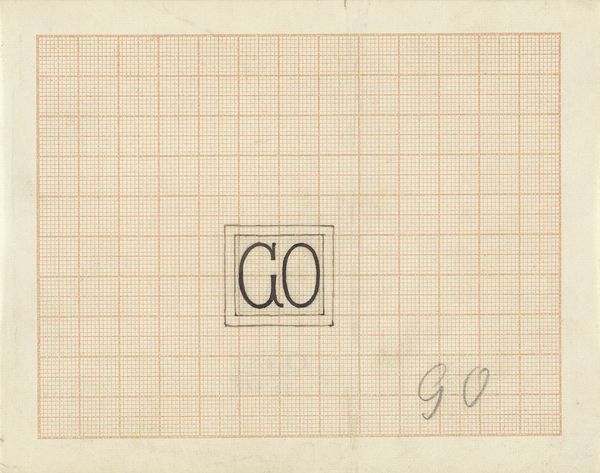
Editor: This is "Ontwerp voor een ring," a ring design from 1913 by Mathieu Lauweriks, rendered in ink on paper. The geometric forms and the graph paper backdrop give it a very precise, almost technical feel. What catches your eye about this design? Curator: Primarily, the geometry. Lauweriks’ employment of a strict grid—both as support and as a compositional element—radically impacts the reading. Consider how the organic, Art Nouveau flourishes are subjugated to the rigorous geometry. Note the tension created by the co-existence of seemingly opposing design principles. Editor: It’s like two different aesthetics are fighting for dominance. Curator: Precisely. We might view the design as a dialogue, or perhaps a negotiation, between the free-flowing lines and naturalistic motifs typical of Art Nouveau and the rigid mathematical order espoused by movements like De Stijl. The tension is visually stimulating. Do you see the use of repetition and symmetry? Editor: Yes, the mirroring of the floral elements creates a strong sense of balance. It is a balance between naturalistic design elements and more regimented man-made elements such as geometric symmetry. Curator: Indeed, that visual harmony created through regulated geometry invites the observer to seek a structured order beneath organic designs. The artist isn’t merely designing jewellery, he is constructing a visual language. Editor: I never considered design could convey ideas in such an intentional, methodological way. Curator: A formal reading provides a fascinating approach to interpreting these kinds of visual systems within artwork and other mediums.
Comments
No comments
Be the first to comment and join the conversation on the ultimate creative platform.
More like this