ornament, print, engraving, architecture
#
historical design
#
aged paper
#
ornament
#
baroque
# print
#
old engraving style
#
traditional media
#
classical-realism
#
line
#
engraving
#
architecture
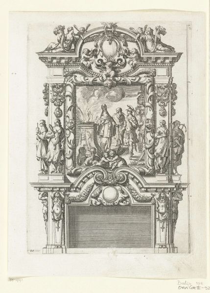
Dimensions: height 232 mm, width 163 mm
Copyright: Rijks Museum: Open Domain
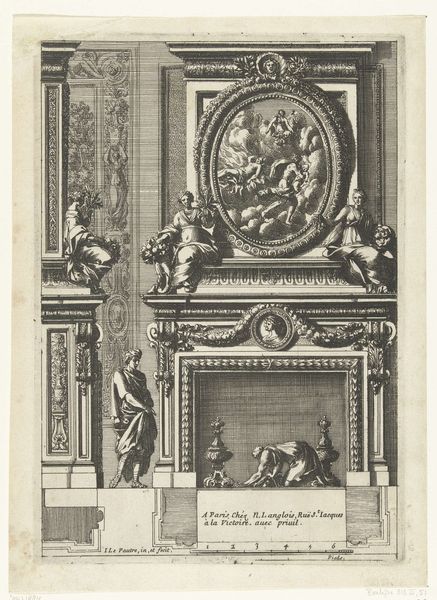
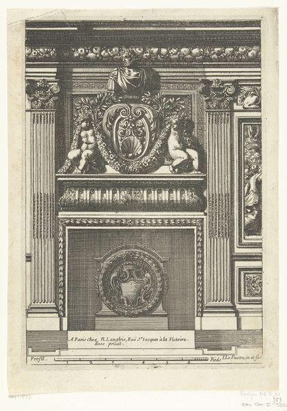
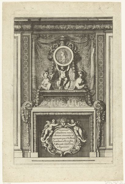
Editor: So, this is *Onderboezem met standbeeld van Minerva*, which translates to something like “Mantelpiece with a Statue of Minerva," created by Jean Lepautre before 1742. It's an engraving, a print, so very graphic in its feel. I'm struck by the overall formality of it, yet somehow it feels very theatrical. What’s your take? Curator: Theatrical is the perfect word! Lepautre wasn't just depicting a fireplace; he was staging a miniature drama. Think about it: Minerva, goddess of wisdom and warfare, elevated above the hearth – the very heart of the home. Do you think he was elevating the intellectual and strategic within the domestic sphere? It’s also Baroque, dripping with ornament, and just bursting with this flamboyant grandeur… and, like a good play, balanced. Look how those figures on the top balcony are balanced by the figures to the side. Isn’t it clever? Editor: Definitely! The symmetry is very pronounced. And the aged paper adds another layer to its grandeur and performance, doesn’t it? Almost as though this mantle piece *and* Lepautre’s depiction are an homage to this ideal domesticity. Curator: Exactly. Though, I’d wager that very few real mantelpieces ever achieved this level of… intensity. I almost wonder if Lepautre, through this impossible ideal, is having a bit of fun at the expense of the ultra-rich… Is there an inkling of mockery amidst the reverence, do you think? Editor: Maybe? Or maybe he was subtly reminding everyone else what they were missing! Either way, looking closely at how he layers depth and detail using only line work has taught me so much! Thanks! Curator: Absolutely! And now I’m questioning whether to tone down the extravagance of my living room. Thanks to *you*.
Comments
No comments
Be the first to comment and join the conversation on the ultimate creative platform.
More like this