drawing, watercolor
#
drawing
#
pencil sketch
#
landscape
#
figuration
#
watercolor
#
romanticism
#
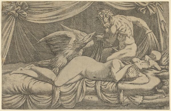
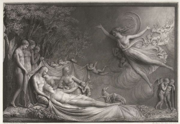
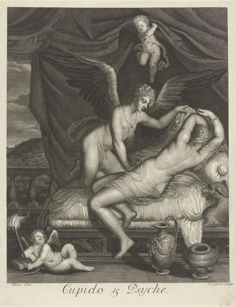
mythology
#
watercolour illustration
#
pencil art
#
watercolor
Copyright: Public domain
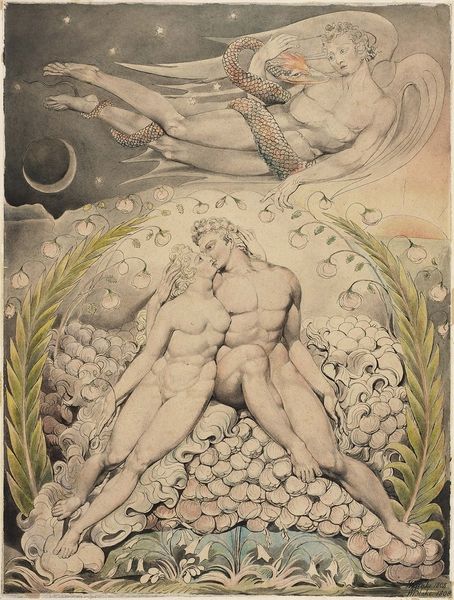
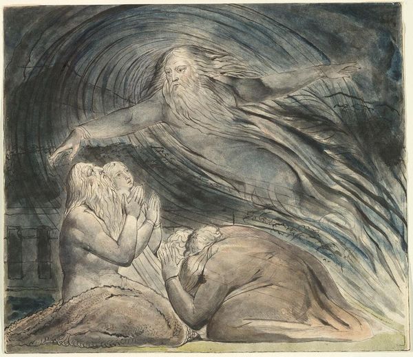
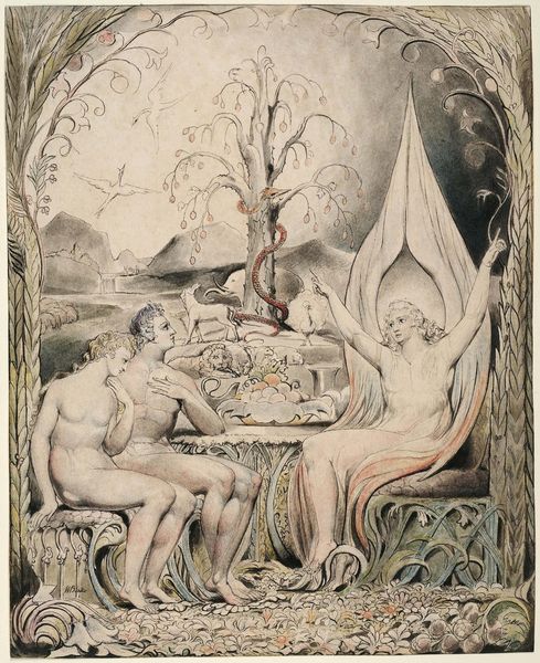
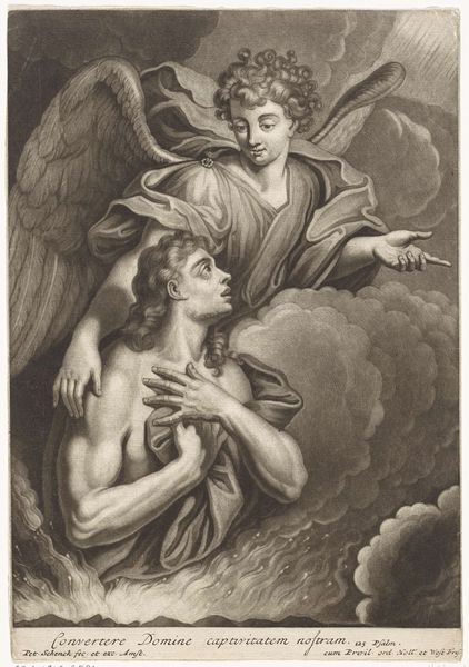
William Blake made this illustration to Milton's Paradise Lost using watercolor and ink. Blake was a printmaker by trade, so he was highly attuned to the specific qualities of these materials. The ink, likely iron gall, has a sharp linearity, ideal for defining the figures' contours. Then, the watercolor wash adds a dreamlike quality. Note how Blake doesn't fill in all the forms; he lets the paper breathe. This isn't just aesthetic; it's about the economics of production. He was often commissioned to make illustrations, so using watercolor was a relatively quick way to add depth and tone. The layering of washes creates a luminous effect, especially in the angel's wings and the moonlit sky, and gives the image its ethereal quality. It’s a perfect translation of Milton’s epic poem into visual terms, one that speaks to both the divine and the very human act of making art. By understanding Blake’s process, we gain a deeper appreciation for the art and the context in which it was made.
Comments
No comments
Be the first to comment and join the conversation on the ultimate creative platform.
More like this