Copyright: CC0 1.0
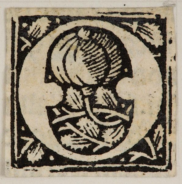
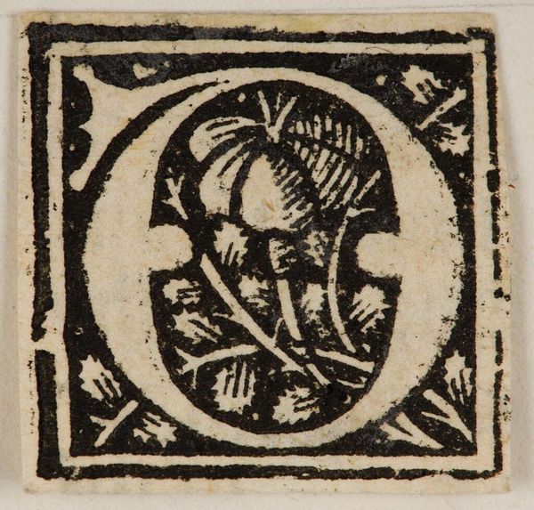
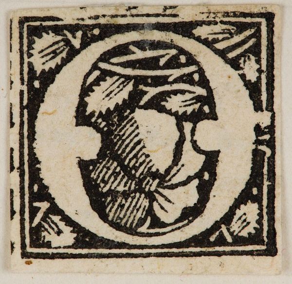
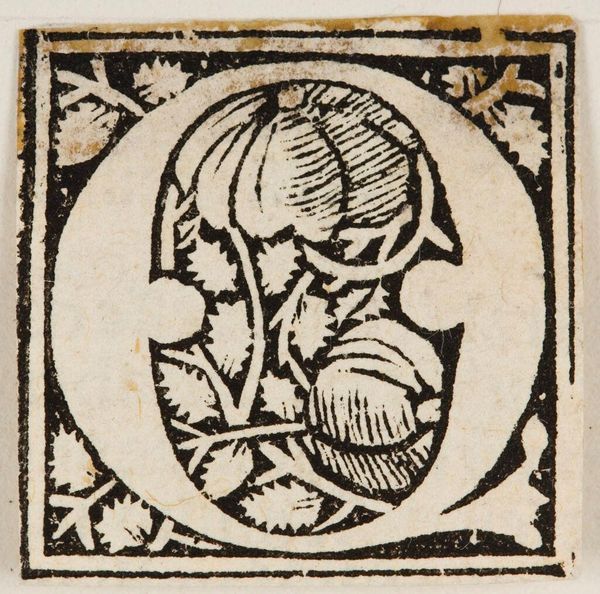
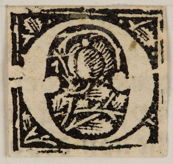
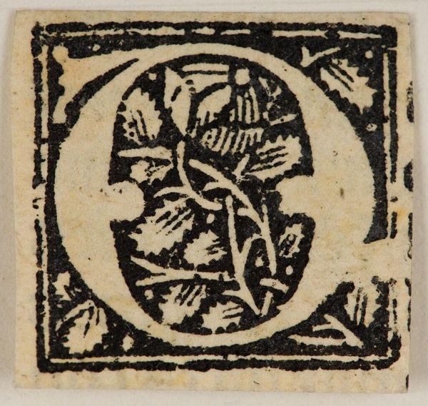
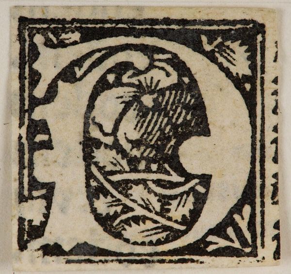
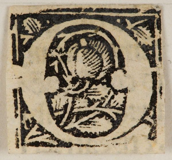
Editor: This diminutive woodcut, "Initial O," artist unknown, presents an intriguing interplay of positive and negative space. The crisp black lines against the stark white create a compelling visual rhythm. What do you make of its formal qualities? Curator: The work's power lies in its economy of means. Notice how the anonymous artist uses line weight to create depth, particularly within the floral motif at the letter's core. The surrounding foliage, though stylized, adds a layer of complexity. How does the composition strike you? Editor: I find the framing foliage a bit distracting. Curator: Perhaps. Yet, it also serves to contain the central form, creating a balanced, almost meditative, composition. Editor: I see what you mean. The rigid frame and organic letterform play against each other. Curator: Precisely. It is through these formal contrasts that the work achieves its visual interest. Editor: I appreciate the emphasis on form and its effect on the whole. Thank you.
Comments
No comments
Be the first to comment and join the conversation on the ultimate creative platform.
More like this