Copyright: CC0 1.0
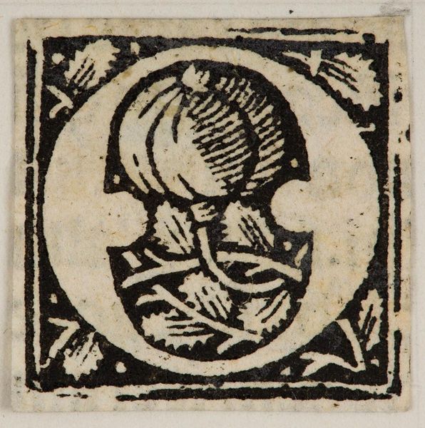
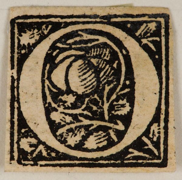
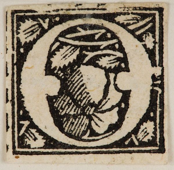
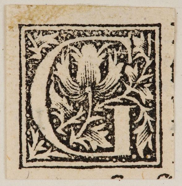
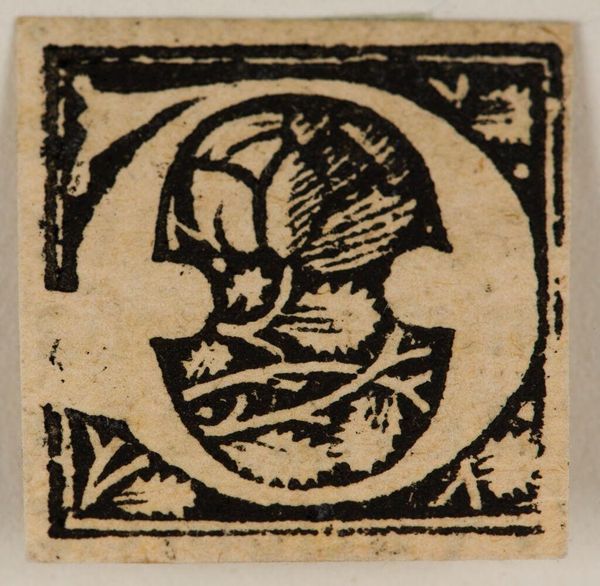
Editor: This is "Initial D" by an anonymous artist, located at the Harvard Art Museums. It’s such a small, detailed piece. What strikes you most about the composition? Curator: The stark contrast between the black ink and the white space is immediately compelling, wouldn't you agree? Observe how the artist uses hatching and cross-hatching within the "D" to create a sense of depth and texture, and consider the border. Editor: Yes, the border really frames it. How does that contribute to the overall effect? Curator: It functions to contain the visual energy. The dense, almost chaotic detail within the letterform is then juxtaposed against the rigid, geometric structure of the border, producing a visual tension. Have you noticed the leaves in the background? Editor: Now that you mention it! I had missed that entirely. Thank you! Curator: Of course. It's a strong example of thoughtful design.
Comments
No comments
Be the first to comment and join the conversation on the ultimate creative platform.
More like this